Employing the correct strategy on Apple Watch for notifying users is crucial for maximizing engagement and interaction without saturating them with unwanted glance notifications.
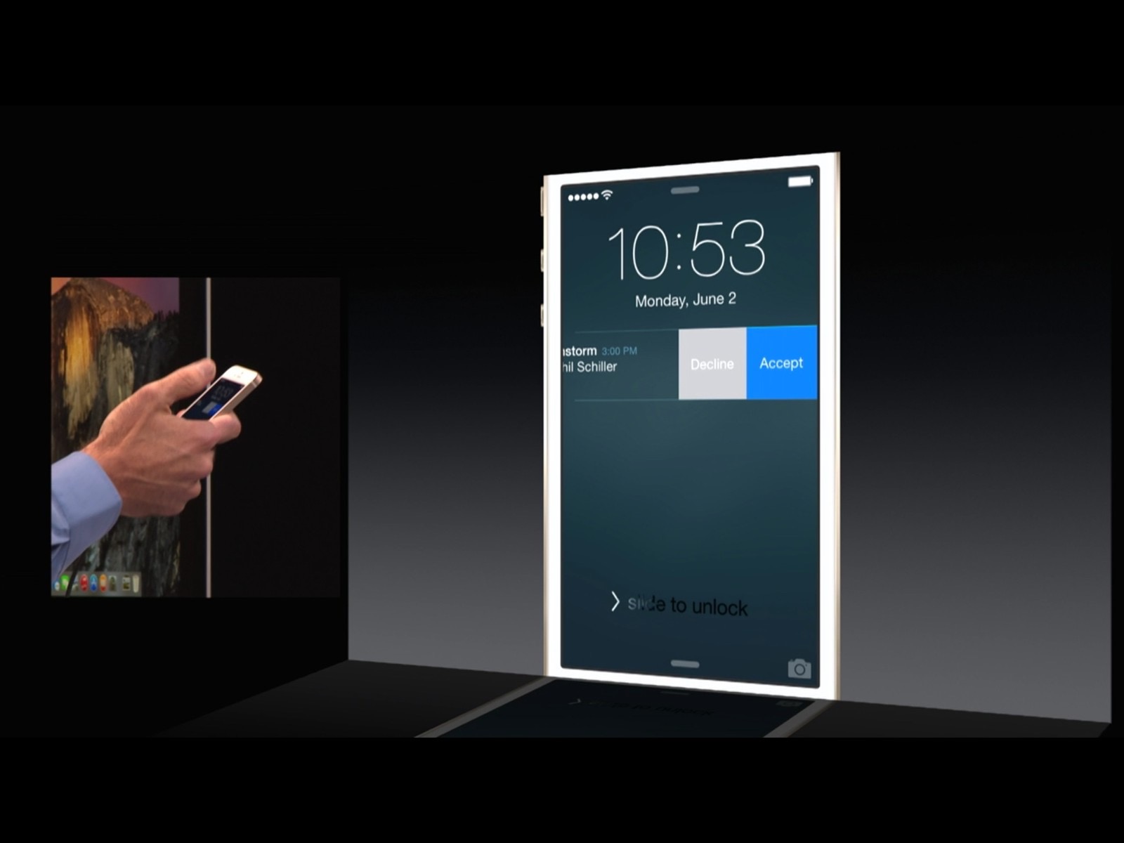
iOS 8 laid the foundation for interactive notifications, which went beyond mere banners toward having the ability to provide responsive buttons. This conveniently corresponds with the Apple Watch, which was announced a few months later and utilizes the same push notification mechanism.
At the core of notifications are the principles of contextualization, relevance, and responsiveness. All of these play an important role in mobile interfaces but are even more critical for wearables, where battery-life is scarcer and the expected interaction life-span is measured in a matter of seconds rather than minutes.
The Apple Watch is expected to play a more intimate and personalized role in one’s life than the iPhone. Compared to a phone, which you have to reach for in your pocket or purse, the watch will be wrapped around your wrist constantly. This means that providing targeted and meaningful notifications is even more crucial in capturing users’ attention without inundating them with meaningless notifications.
In this article, we will show you how to do just that with the 5 Best Ways to Create Engaging Notifications on the Apple Watch.
(Want to build your own Apple Watch app? Learn how we can help.)
1. Design Short-Look and Long-Look Notifications with Purpose
Apple segments Apple Watch notifications into what they call short-look and long-look notifications.
Short-Look Notifications
A short-look is essentially a subtle and abbreviated notification that is non-interactive. It lets the user know there is a notification from an app and is visible only briefly.
As the app creator, you have the chance to present a brief message, similar to the one pictured below:
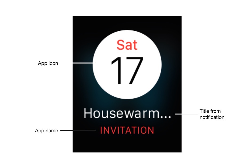 You are quite restricted in the design for short-look notifications, which is limited to a template that includes the iOS app icon and name (presented in the app’s key color).
You are then left with just the title to customize and configure. The purpose of titles, according to the Apple Human Interface Programming Guide is to provide a brief hint only. So it’s important you leave the specifics for the long-look.
Long-Look Notifications
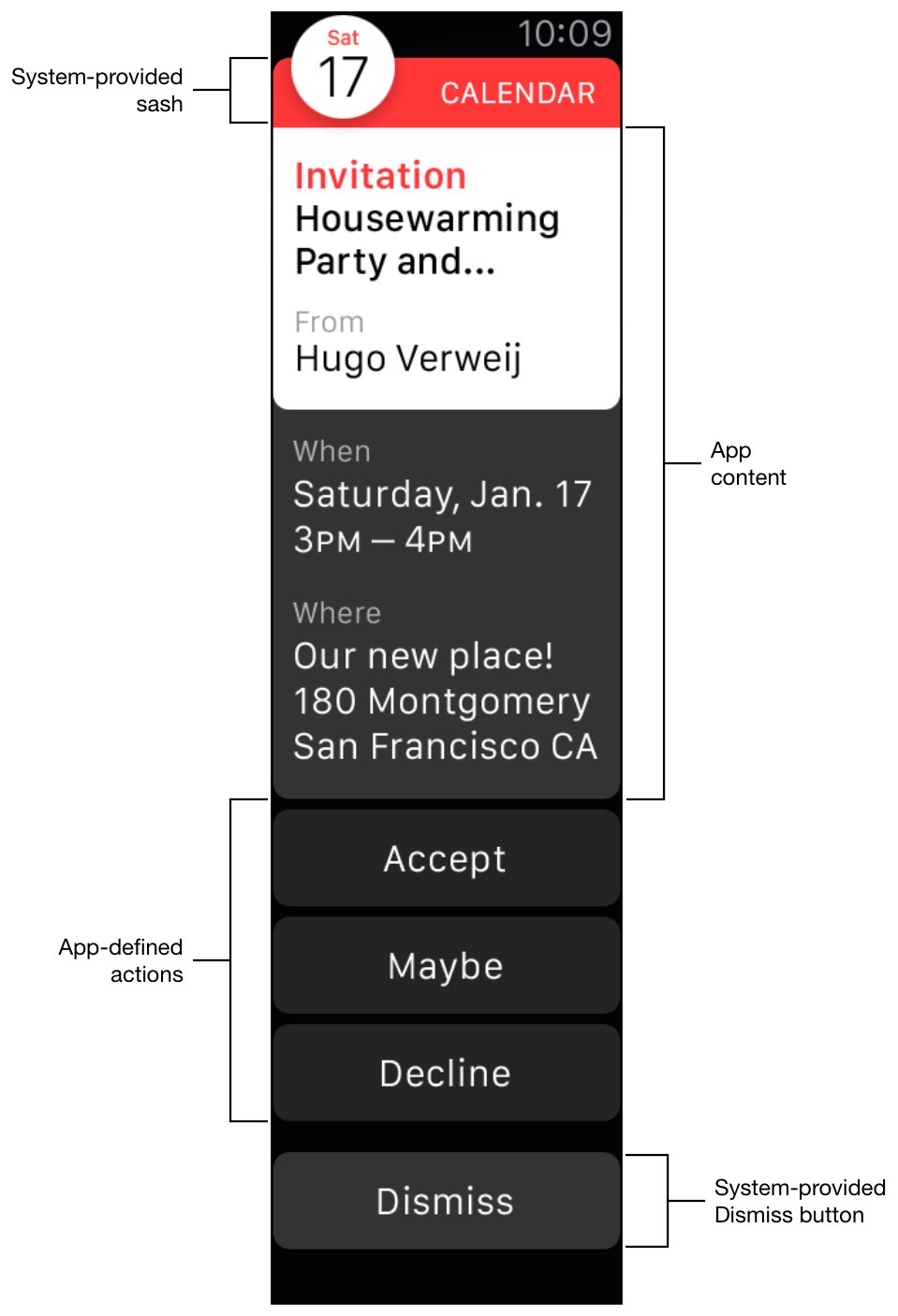
Long-looks provide greater detail on the notification, which is customizable with bespoke graphics and branding and provides the ability to incorporate a scrollable view, action buttons, and a dismiss button.
Long-looks are purposely designed for greater detail on the incoming notification. While you can go with the default long-look appearance, you also have the ability to incorporate your own app branding and design, beyond the default sash you get in the interface.
You can provide custom content (as illustrated above) as well as custom buttons as a way of capturing interaction and sending it back to your iOS app.
As notifications should always aim to be personalized, it is highly advisable that you customize your long-look notifications and take full advantage of the ability to provide custom interaction and content.
For more information on Apple Watch notifications, consult Apple’s Human Interface Programming Guide. In most cases, Apple Watch takes advantage of your existing notifications framework on iOS for free, but you can further customize your notification interfaces with custom graphics and branding.
2. Quick Responses Are Ideal
The concept of keeping it short is ever-relevant when it comes to the Apple Watch.
The fact that you cannot type on the Watch shouldn’t be perceived as a limitation but rather a way to focus your app design so that you provide precise shortcut actions for users to respond in relevant situations.
Apple Watch design principles dictate that interaction should be capped at 10 seconds, largely due to battery considerations with the device. Anything beyond 10 seconds should either be redesigned to fit within the advised duration or be handed off to the iPhone.
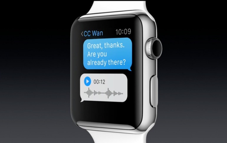
The Apple Watch was made for pre-conceived responses like the one shown above. But anything more complicated, and you should hand off the notification to your iPhone.
The key to remember is: It is more convenient to look at your wrist than to take your phone out of your pocket.
So wherever possible, use the constraints of the Apple Watch as a guide to allowing you to provide quick responses. If no pre-determined responses can be deduced, then it’s time to let your phone do the talking, so to speak.
3. Embrace Not Having a Keyboard
Continuing from the point above, you shouldn’t see a lack of a Watch keyboard as a limitation. Your Watch app is not a replacement for your iOS app but rather a portal for your users to get notified of events, and that’s the role you should see your Watch app playing (at least for now).
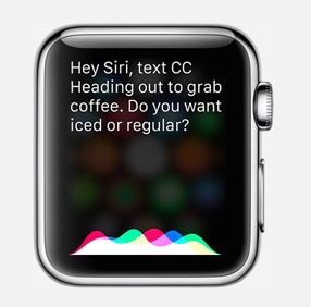
Rather than lamenting the lack of keyboard, use the tools that you do have at your disposal, from pre-defined buttons to the use of Siri in some cases. Oral or visual responses work best with minimal real-estate and scarce battery.
Visual responses are buttons that you can either statically define as close-ended or dynamically define based on a message. The latter works well in cases where you can deduce that there would be two options and thus can create two buttons, as shown below.
4. Provide Greater Control Over Notifications
Managing the types of notifications users receive can be a make-or-break situation where being over-saturated with irrelevant messages could force users to go out of their way to disable all notifications for your app or, even worse, delete your app altogether.
Providing users with the freedom to opt in or out of specific notifications, rather than an on/off switch for all notifications gives you a channel to still engage your users without annoying them. It increases their confidence in using your app by showing them you appreciate their personalized preferences and won’t send them poorly-targeted notifications.
For instance, a user may have the Major League Baseball app. Rather than being inundated with news notifications from all the teams, he might want to filter based on specific teams or geographic areas. Providing this option will give your users a more personalized experience.
Furthermore, the user may decide she only wants news twice a week or every Monday morning. This is what is called behavioral adaptability and works well with our next principle of learning from your users, which is conducted implicitly through learning and observational patterns.
5. Learning From Your Users
Armed with both an iOS and Apple Watch app, developers should take advantage of this extra channel to learn more about a particular user’s preferences and habits and implement behavioral adaptability.
We talked above about embracing the Watch’s lack of keyboard. Well, being able to evolve your user interface more contextually based on learning more about your user is the best way of making use of limited screen real-estate.
The idea is to filter notifications based on what users like implicitly rather than explicitly, for instance where their dismissal patterns of notifications can be recognized or they always select a specific response to a type of notification.
Providing an additional see-less button on the long-look notification, you can use the Watch app to dynamically adjust the user’s filtering preferences.
This will uniformly be applied to both your iOS and Watch app, allowing both platforms to benefit from learning about your user’s preferences. You can also proactively prompt your users to query whether they would be interested in seeing more of a particular content they are browsing.
If a user gets notifications from a store for clothing and she prefers shoes, evolve your notifications to include more shoes. If a user prefers certain colors or sizes, send sales notifications for those particular preferences.
Continual user learning increases relevancy and ultimately creates a more engaging and enjoyable set of notifications for your users. Gathering behavioral information to learn from both platforms allows for a more catered approach to notification delivery.
