An exit survey can help you discover why users are leaving your app or service. Here’s our top advice for crafting and implementing a successful exit survey.
A well-crafted exit survey is an invaluable tool for user research and retention.
By polling the people who have unsubscribed from your product, you can figure out what frustrations or unsolved needs have led to their decision to quit you. More importantly, you can determine how to fix the problems.
In addition, you can use the exit survey as an opportunity to point out features that your users may have missed or under-utilized.
Thus, in the best case scenario, these quick polls will help you improve your product, win back dissatisfied users, and increase your retention rate.
Read on to learn how to build an effective exit survey for your website, mobile app, or game.
1. Keep It Short
When users are confronted with long surveys, they typically react by either quitting mid-survey or “satisficing” (i.e. choosing arbitrary answers in an effort to quickly finish). Obviously, either of those reactions will hurt your survey results.
Avoid this by keeping your exit survey as short as possible. As a rule of thumb, you should stick to 10 questions or less.
Take a look at this SketchUp example, which includes a mere three questions.

The app makers undoubtedly could have requested more information from their respondents. But, by making the exit survey so quick and easy, they’ve probably dramatically increased the number of respondents.
Similarly, when you design your own exit survey, you’ll have to make a trade-off between the number of questions and the response rate.
2. Decide What You Need to Know
… vs what you want to know.
For example, you probably want to know if your users or customers are switching to a competitor. However, you need to know why they’re so unhappy with your product they’re giving up on it.
The first piece of information is nice to have, but you can’t use it to improve your product like you can with the second.
In general, you should be able to explain why every single question in your survey is there and why it’ll help you make your app or site better.
3. Decide What You Want to Say
… vs what you need to say.
Many people use their exit survey as an informational tool for users. For example, this Sidekick exit survey asks if the respondent has tried the “email profiles” and mobile notification features.
This approach is great. But, as with the questions you ask, it’s crucial that you’re strategic about the features you point out.
Here are some things to keep in mind when choosing what to point out in a “Did you know…?” question:
1. How many of your users regularly use this feature/visit this section/click on this? The more popular a feature is, the less likely it is that the survey taker doesn’t know about it.
2. How useful or cool is this feature? Is it something that will make or break the decision to keep using the product?
3. How new is this feature? Is it something you just added that not many users are aware of yet?
4. How relevant is this feature to common pain points with the website, mobile app, or game? Does it fix a problem that a lot of users are having?
Rather than picking one or two features to call out and showing every respondent those options, you can design your survey so that once users have chosen the main reason for their dissatisfaction, they’re shown a feature that most closely answers it.
Let’s say I choose “too expensive” as my explanation for uninstalling an app. In response, the next window might say, “Did you know we offer a basic version for only $2.99 a month?”
However, if I choose “too confusing” as my explanation, I’d get “Did you know we offer detailed user guides, community forums, and live chat with our representatives?”
While this technique allows you to serve up features to a targeted audience, it also assumes the respondent has correctly chosen his or her primary reason for uninstallation as opposed to the first one that sounded good. It’s giving your survey participants a lot of trust — which unfortunately can backfire.
4. Be Transparent about Length
If people are given an expectation of how much time it’ll take them to finish the survey, they’re much more likely to begin and complete it. If they have no idea how lengthy the questionnaire is, they’ll probably assume it’s long.
There are several ways to set length expectations. You can take the straight-forward approach and tell them in your introduction, “This survey should take approximately three minutes.”
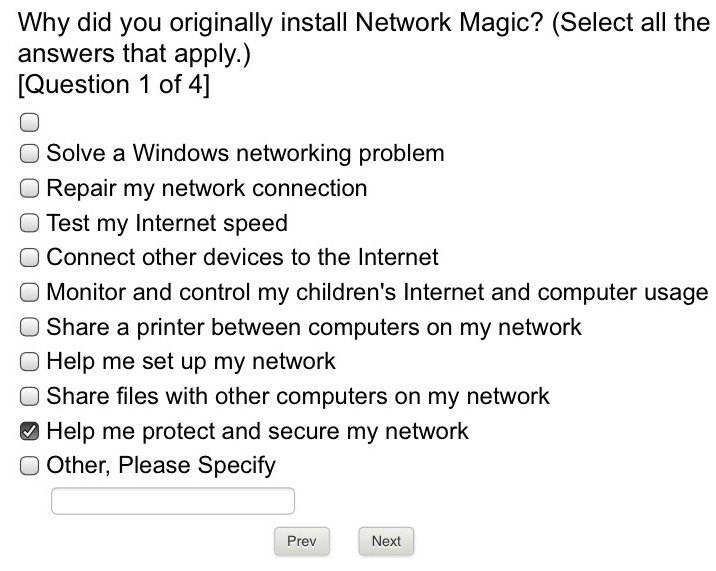
Another option is to include a progress bar and page/question numbers, i.e. “Question 3 out of 7,” or “Page 1/2″ (like this Network Magic survey).
If you decide to use the first technique (which I recommend), send your survey to friends and family before it goes live and measure how long it takes the average person to complete it.
5. Have an Engaging Introduction
On top of somehow disappointing your users, you’re now asking them to spend precious time helping you improve your product — with no clear benefit to themselves. To motivate people to take your survey despite this fact, make it humble, appreciative, and friendly.
Check out this example from PaperCut.
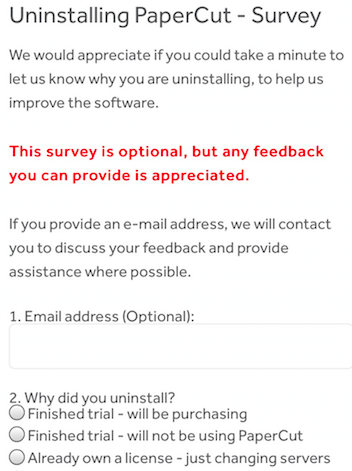
As you can see, this introduction is laid-back and human-sounding, which makes it pretty effective.
Here’s a template:
Thank you for trying out [product name]. We’re really sorry that it didn’t live up to your expectations! Will you help us make it better by filling out this X-minute survey?
6. Think of Why Your Product Might Fall Short
Now it’s time to get into drafting the actual questions.
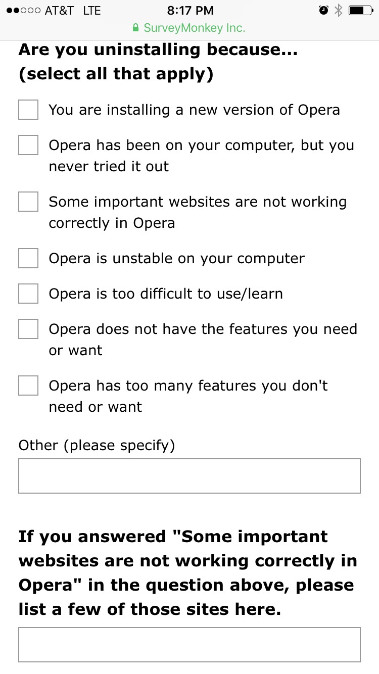
Most exit surveys, such as this Opera one, include a checkable list of potential reasons why someone is opting out.
You want this list to be fairly comprehensive. After all if the scope is too narrow, you won’t get any good data.
Here are some universal themes to get you started:
It’s too expensive.
It’s too time-consuming.
It’s too buggy.
It’s hard to navigate.
The interface is unappealing.
It has too many features.
It doesn’t have enough features.
It’s too slow.
It’s not functional.
It has too many updates.
It sends too many notifications.
It takes up too much storage space.
It’s not as good as the alternative.
I suggest gathering your team in a room and writing down all the negative feedback you’ve heard from users, friends, family, other people in the space, and so on. Then, mark the most common responses.
While this exercise isn’t exactly fun (painful might be more accurate), it’ll ensure that every user taking your survey feels like you’ve provided an honest and complete list of explanations.
This shows the former user that you’re not so taken with your product you can’t see its flaws. Who knows, that may even be enough to convince them to stay!
7. Include an “Other” Option
When Groove changed their exit survey from a drop-down format to an open-ended one, their response rate jumped from 1.3% to 10.2%.
So, am I suggesting you give your survey responders the same freedom? No, and here’s why: It’s likely that the answers will be so varied that you won’t get any usable data.
But, by including an “Other” option or an optional comments section, you can standardize your results without blocking your users from giving you feedback you haven’t anticipated.
Take a look at how iMacros used this strategy in their uninstall survey.

Concluding Thoughts
A well-crafted exit survey will give you the information you need to boost your customer retention rate. Every website, mobile app, and game should have a thoughtful one in place.
