Despite what anyone might say to the contrary, size does matter.
Consumers around the world have an appetite for huge screens, and mobile suppliers are doing their best to fulfill this craving. Since the first iPhone was released in 2007, the screen size has almost doubled its diagonal measurement (from 3.2 to 5.5 inches), not to mention other phablets like Sony’s Xperia Z Ultra with its 6.4 inches!
Apple seems to have had a change of heart and — despite previous claims — finally brought to life two bigger devices, calling the iPhone 6 “bigger than bigger.” And in the case of the iPhone 6 Plus, you get “plus bigger than bigger.”
This all begs the question of how to design for the iPhone 6 Plus and other phablets.
There would be nothing wrong with these larger screen sizes, if only designers and developers prepared dedicated layouts for those devices. Unfortunately, more often than not, the app content is stretched and made to fill the big new screen. This results in a nasty and cheap copy of what we can find on smaller devices.
Correct me if I’m wrong, but I thought the whole idea behind buying such a big phone was to see more. We designers have more space to arrange navigation and content and reinvent the user experience. Why not use it?
As the image above shows, the new layouts are just bigger. No other changes have been made.
Our hands vs. comfort zones

As seen in these Thumb Zone Heat Maps, it’s harder to “thumb” not only on the vertical dimension, but along the horizontal too.
The “natural” zone is pretty small compared to the overall phablet screen size, and it’s placed in the lower center of the screen. The craziest thing is that the whole navigation is in the upper part, where most of us can’t reach!

In comparison to the 3.5 and 4 inch iPhones, navigation hasn’t changed a bit. Every navigation bar and button placement is in exactly the same place. Even on smaller screens, this navigation requires flexibility from our thumbs. On bigger screens, it’s simply madness!
How to deal with it?
Don’t worry, you don’t have to pray for faster evolution! There are already a few thumb-friendly options available on the market.
One interesting accessory is the Thanko Thumb Extender from Japan:

Unfortunately only one size and color is currently available. But, on the bright side, it works with all touchscreen devices.
There is also this handy iPhone case designed by Gusoh, also from Japan.

But those solutions look rather funny. I doubt that any executive businessman will cover his high-end mobile device with a green piece of plastic.
Instead, I strongly believe that changes have to be made in the very beginning, starting with the OS and apps themselves.
“…the ensuing task isn’t as simple as just magnifying a small existing interface onto a bigger screen. In talking to some of the best UI designers in the industry, it’s become clear that as screen real estate has stretched beyond the reach of one thumb, it will impact topics like button placement, gestures, and content layout significantly.”
Both Apple and Samsung have come up with some solutions. For example, Apple offers the double-tap of the Home button, which shows only the upper part of the screen. For its part, Samsung created a “one-handed operation” feature, which enables the user to set the size of the displayed content.
Alternative navigation ideas
To be honest, I don’t like any of those ideas.
I also looked through different blogs but was only able to find information about comfort zones and Apple’s Reachability feature. I didn’t find a single tip on how to reinvent phablets’ interface architecture. That’s when I started to imagine how great it would be to navigate through the app from the user’s point of view.
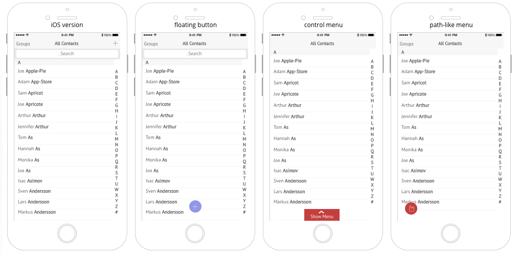
As a result, I’ve prepared navigation alternatives for the basic “Contacts” app on iOS.
(Pssst, if you view the mockups above on UXPin, you can interact with the design by clicking on the red elements.)
Floating action button
Yep, one of the options, a floating action button (FAB), seems to be taken from Android Material Design. Why? It’s small, handy, and just where you need it. Google knew what they were doing when they put it there.
Of course, this solution can be transformed into a floating menu with a set of left/right aligned buttons. But there’s a minor drawback in Google’s formula – all those buttons have to represent related actions, which limits the use of FAB. My suggestion is to expand actions’ context and gather them together to make it useful.
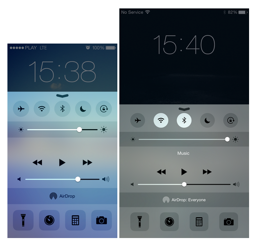
Control menu
The second option is something I like to call the control menu (as in, iOS Control Center). It’s also handy, and it doesn’t take up much space on the screen. Basically, it’s just a navigation bar hidden at the bottom of the screen.
Path-like menu
To prepare the last project, I used an idea from Path that I’m calling a Path-like menu. It looks good but adds additional clicks and prolongs the interaction. The question is what will users prefer – an unreachable but “it’s-all-there” navigation or the “I’m-here-but-click-me-twice” buttons?
Conclusion
The bottom line is we all have something to say about UX. You don’t have to be a design guru to highlight such problems and look for solutions. Many of us design and develop apps for thousands of consumers; don’t let them be miserable! Let’s make great apps and truly enrich users’ experiences.
I’m sure you can come up with a number of other ideas. If you do, please share them in the comments below!
