As the world anticipates the launch of the Apple Watch line of wearables in 2015, developers have begun familiarizing themselves with the WatchKit SDK and XCode WatchKit Simulator.
While the engineers are keeping busy on the programming aspects of WatchKit, designers should start focusing on the important UX facets of designing Watch apps. For designers, Apple has provided the Apple Watch Human User Interface Guide, which should serve as the foundation for conceptualizing and prototyping.
(For more great tips on Apple Watch design and development, check out our previous articles in which top designers imagined what your favorite smartphone apps will look like on Apple Watch and we share six potential Apple Watch apps that will make your life easier.)
If you’re looking for someone to design and develop your Apple Watch app, find out more here.
Quick Primer on the Apple Watch
As you might already know, Apple’s prized wearable will come in two screen sizes, 38 mm and 42 mm. The screen is touch-sensitive, and while gestures are not supported, pressure-sensitive touch is included to distinguish between tap and hold. There is also a digital crown on the side of the watch, which can act as a way of scrolling (without obstructing the screen with one’s finger), zoom (such as with maps) and pressing a button (which acts like the home button on the iPhone).
In this article we will go through five important design principles for Apple Watch, touching on both UX and UI, to help guide designers in producing optimally-designed wearable apps.
1. Design for the Apple Watch Real-Estate
Apple has provided a set of Photoshop (PSD) resources to help designers prototype user interfaces, which should serve as a good starting point for conceptualizing and arranging UI elements. (Please note that you will need an Apple Developer account in order to access this resource.)
When you begin to design your screens, the first principle that’s important to remember is that you don’t have the affordance of the screen size you would have on the iPhone, which forces you to focus your purpose of the screens more carefully, emphasizing only the core functionality and message you wish to deliver. The good news is that you can use the entire space of the screen, edge-to-edge, without any need for margins, as the wearable’s bezel adds the necessary visual padding.
UI Controls
When using controls, such as buttons or switches, look to limit the number of elements stacked horizontally (side-by-side) to three at the most, in order to avoid hampering the tap-target of each element.
Apple also advocates using icons wherever possible, instead of text, to once again maximize screen real-estate. Less-frequently used buttons should be placed in the contextual menu, instead of cluttering the active screen interface.
Circular Buttons and Icons
A recent article by HowToDesign discussed the merits of the use of radial or circular icons, as opposed to square ones. As the author explained, circular icons have the advantage of having the “ability to have more points adjacent to your finger at the same distance when touching the screen. With squares, the path to the next item would be variable and there would be a smaller limit to the number of items you could fit around a touch point.”
Additionally, the author suggested that circular elements are more scalable and can be variably sized to demonstrate prominence relative to other adjacent circular buttons or icons, which is especially important on smaller-screen devices.
Different Image Sizes
With the past few versions of the iPhone, iOS developers have become accustomed to catering to different screen sizes and resolutions when it comes to images, and it’s no different with the Apple Watch. If an image does not scale well, ensure that you provide separate images for each of the two screen sizes. Fortunately, since both screens will be retina, you will only need to provide your images as @2x when bundling.
2. Design Your Icons to Represent Your Brand
Whereas iPhone app icons are rounded rectangles, Apple Watch home-screen icons will be circular and will vary by size depending on where they are positioned relative to the center of the screen, as shown above.
Icon Size and Shape
When designing your icons, you will design them as square images and then the system itself masks the icons to create the circular shape automatically. The chart below, taken from the Apple Watch Human User Interface Guide, is a good reference regarding the sizes of the various types of icons for both versions of the Watch.
Visually Recognizable
You should also construct your icons to be visually recognizable and reflective of your brand, which in almost all cases will be an exact visual replica of your iPhone app icon. Maintaining as close a design as possible to your iOS version helps draw mental association with the app on both platforms.
As head of Apple design Jonathan Ive once said, “Simplicity is not the absence of clutter, that’s a consequence of simplicity.” This is the notion you should take when contemplating cramming in lots of images and icons, when a more elegant, well-conceptualized, and abstract metaphor could deliver clarity to your users.
3. Design with Good Typography and Color
iOS 7 heralded the start of the Helvetica Neue era for Apple, marked by the transition to the flat design and discarding of the aging skeuomorphic designs. Now Apple is transitioning once again to focus on creating simple, crisp interfaces built on the foundation of typography that is thin and purposeful. For Apple’s wearable, they have opted for the aptly-named San Francisco font, which is a new sans serif font.
Dynamic Font Type
The selection of the system font used in Apple Watch is purposefully designed for the best legibility, based on appropriately-condensed letter spaces to take up the least amount of horizontal space. Glyphs in the font have larger apertures, making it easy to recognize the characters, even while glancing.
More notably, as the font size increases, the font type changes dynamically to maintain its legibility, which is called Dynamic Typing. This is a great gift that developers get for free when they opt for the system font over custom font, as it senses and adjusts the fonts, line spacing and letter spacing accordingly. You simply specify whether the text is body, footnote, or headline, and the system knows how to select the appropriate text-size settings.
Being a good developer, supporting dynamic fonts means supporting accessibility settings. If you opt for custom font, you will be responsible for managing the font sizes according to accessibility changes, whereas using the system font allows you to get Dynamic Type Font support out of the box.
Finally, always aim to use only one font throughout your app for consistency. Mixing fonts will break the UX best practices Apple is championing. You should instead take advantage of using various shades of white to emphasize various text elements, and use your primary text color to further distinguish a prominent label (more on this below).
Contrasting Colors
The Apple Watch Human User Interface Guide promotes a strong distinction in contrast between text and background, while avoiding bright colors. You should make use of one primary (key) color that symbolizes your app’s branding, which would feature prominently in distinct labeling, such as for titles or to discern important information.
Apple highly suggests you conform to having a black background for the app, which will not only allow for seamless visual blending between the background and edge-bezel of the device, but will also maximize the legibility of text.
4. Design with Contextuality and Unobtrusiveness
Appropriate Levels of Hierarchy
The hierarchical/paging paradigm on the Apple Watch is akin to its iOS sibling, the UINavigationController, a master detail design model, where you essentially present a view, subsequently drilling down the hierarchy as your get finer detail.
A key difference between the mobile and wearable platforms, when it comes to master detail, is that on the latter you can very easily get lost when you have four or five screens to drill down into. So you should not enforce the same level of detail you have on your iOS version on the Apple Watch.
Focus is key — essential information that necessitates quick glances on the wrist is all that’s needed. Any additional information should be transferred through Handoff to the larger-screen iPhone.
Predictive Intelligence
Continuing from being focused on essential and contextual content, what you should really aim for is predictive intelligence, based on knowledge. The nature of wearables, with their smaller screen sizes of 38 mm or 44 mm, is that you don’t have the luxury to represent the same information you would have on your iPhone.
The aim is to filter your presentation to only the information the user anticipates, while either providing a set of action buttons to get a quick and concise response, or transferring more complicated sequences via Handoff from the watch back to the iPhone.
You do this based on various scenarios:
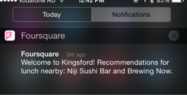
1. Proximity-awareness: Presenting notifications or glances based on the user’s current proximity to a point of interest. Foursquare, for instance, would remember locations you have been to previously or significant landmarks, and notify you with an unobtrusive reminder.
2. Behavioral-awareness: Based on the specific interaction, you should provide the ability to rapidly respond using quick-action responses, such as like, reply, mute, or remind me later.
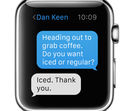
Apple demonstrated contextual responses in its iMessage app by providing anticipative responses based on specific message keywords. For example, if someone messages “Do you want iced or regular?,” it would prompt the user with two buttons, one for iced and another for regular.
Thinking in a more contextually-adjustable mindset is the goal of predictive intelligence. If your device could operate based on your routine, such as when you head to work and how long it takes based on traffic conditions daily, building and mining data on your habits, it would be able to prompt you when to leave with more accuracy and contextuality.
Granted, this is quite a complicated feat to accomplish, but thinking in this way, even with smaller predicables, makes for a better UX. This should be the goal, and Apple hinted at that when they introduced iBeacon. This is the future: behavioral mining is predictive analysis.
5. Design for Glances and Notifications
Glances Can Deep-Link
Glances aren’t mandatory for every Apple Watch app, you can rely on just passing notifications to the Watch. But if you do decide to use glances, make sure you use them correctly.
A glance occurs when the user activates the watch by tilting his wrist. When he taps on the glance icon, it should be contextually aware and present relevant and informative information, unambiguously, allowing the user to decide whether to tap and continue the interaction on the iPhone, or ignore.
Speaking of Handoff, utilizing Continuity allows your app to be informed as to what was displayed on the wearable and subsequently present on the iPhone, when tapped, as a corresponding and related screen.
This is called deep-linking, and when you receive notifications on your iPhone, such as a message from someone, you should expect the app to open up and present you with that specific conversation.
Notification Content and Frequency
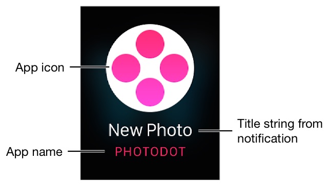
Notifications on Apple’s wearable facilitates providing lightweight and unobtrusive messages through two types of notifications: short-look and long-look.
Short-look notifications provide discreet, minimal content to the user through local or remote notifications without disclosing private information (i.e a text message would show the person a new message icon, but not the actual message) and are visible when the user elevates his or her wrist.
Long-look notifications occur when the user either taps the short-look notification or the wrist remains elevated, and a more informative notification appears along with more functionality, such as the ability to respond with buttons.
When implementing notifications, you need to be mindful of the frequency, which may turn what should have been subtle and discreet into something obtrusive and irritating. Notifications embody convenient glances with minimal information, enough to hint to the user whether to further interact with the app or defer based on its importance in the moment.
Notifications should allow you to distinguish infrequent messages that are important from those that aren’t, while ensuring you don’t “bug the user.” If you are unable to filter notifications, such as if a user is receiving a message through a conversation, you should provide the ability to mute the conversation for a specific period of time, similar to how Facebook Messenger does on iOS.
Long-Look Notification Design
When designing your custom long-look notifications, you can have up to four action buttons, which appear automatically in most cases. The dismiss button also appears, which means you don’t need to specifically create your own.
For all rectangular buttons (as opposed to circular), you should aim to have them span the entire width of the screen and give buttons the same UX treatment you would generally provide on other platforms, including providing the same font style, consistent button heights, and the system-standard 6-point rounded corners.
Notification Layout
When configuring the notification screen interface, being conscious of the layout, and what you can and can’t do, is important. Firstly, you need to ensure any title strings you have fit gracefully in the label and on the screen symmetrically. So brevity is pivotal.
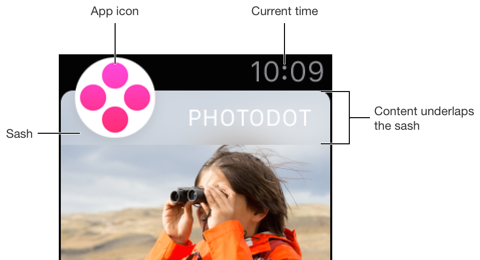
The notification interface allows you to set an image background, some labels, the app icon, and sash. You have the option, according to the Apple Watch Human User Interface Guide, to have your content above or below the sash, but the contemporary design solution is to always try and have it overlap underneath, similar to how iOS 8 has content overlapping underneath their navigation bars.
Modal Design
A modal sheet is a vehicle for delivering information to the user modally, while preventing or interrupting the user from her previous other interactions, thus bringing immediate attention. That is, it interrupts the normal flow and prompts the user for an interaction.
You should minimize the frequency of modals as they can certainly be disruptive. But it’s important to recognize that they are useful in certain scenarios, such as confirming or prompting a user about something that’s imminent and important and requires his or her attention.
What constitutes important is at your discretion, of course, but the consensus is, if something needs to explicitly be confirmed or abandoned, and in its absence the app would be in an ambiguous state, then the use of a modal is probably the right call.
Force-Touch Menu Design
Contextual menus appear when you force touch the screen, presenting a menu that is relevant to the part of the screen and content you are viewing. It is meant to be space-sensitive, making the most use of the rectangle and permitting you to display anywhere from one to four menu items. Not all screens should have menus, so they should be used sparingly and purposefully.
Menus also have a standard text label below the icon, which cannot be styled differently. So you need to adhere to the standard system font size and type for menu labels and should encourage font-type continuity.
Conclusion
While the Apple Watch Human User Interface Guide will be the foundation of your designing toolbox, this article provided you with five important design principles for Apple Watch. From working with notifications (including design and frequency calibration), to focusing on contextuality and even predictive analysis, you have five important areas to consider when prototyping your interfaces over the next few months.


