Your startup’s identity is one of the most important assets of your business. The visual personality behind your startup should represent your core mission. And you know what they say … first impressions count.
It’s especially important if your business is in a highly competitive market, in which case you’ll probably need to put as much attention into boosting your brand equity as you do your core product.
Creating a visual identity can be a somewhat time-consuming process, as there are a number of elements you need to take into consideration, including symbolism, typography, and color combination.
For this post, I will use a recent example of a brand called Student Acuity. Unfortunately, the startup is now dormant. Nevertheless, it was an awesome project to work on and a perfect example for this area of discussion.
The Logo
Of course, one of the most important assets of your identity is your logo.
The logo will likely be one of the most time-intensive aspects of your complete identity. However once you’ve nailed it, the rest should fall into place fairly seamlessly.
I usually start the logo creation process by researching the company’s competitors. In my case, Student Acuity was a product intended to help students in high school to pursue their future with the help of teachers and parents. Their core product was to measure what the student was currently attaining in their grades verses what they should be achieving.
It’s OK to be inspired by competitors, but keep in mind that they are your competition, after all, so you should try not to be influenced too much.
Once I’ve done my research and have a good grasp of the company’s mission, I begin to sketch some rough shapes and ideas.
I always identify three types of logo that can be pursued: Illustrative, Typographic, and Iconic.
After having multiple discussions with the client and looking at my ideas in the initial sketches, I decided to take the logo in the direction of an Iconic approach.
I came to this conclusion as I personally felt the name “Student Acuity” would not be significant enough to be a Typography logo. I just was’t convinced the name would be rememberable enough on its own.
I also excluded an Illustrative approach because I believe there should be a decent ratio balance between the company name and the accompanying graphic.
Logo Symbology
Once I decided I was going to take the logo in an Iconic direction, I began to mockup some symbology. I carefully chose a few words that were strongly associated with Student Acuity’s mission and personality, which were Performance, Direction, Goal, Ambition, Communication, and Vision.
It’s important to note down some words that truly represent your company’s objectives and mission to help with this process.
If you’re a single founder, it might be a breeze to do this exercise on your own. However, if you have cofounders, it might be hard to pinpoint specific words on which you all agree. In my experience, if you have cofounders, you should probably budget a fair bit of time for this exercise.
I replicated the selected words for Student Acuity by using common symbology that is strongly associated with each one. At this point, I began to start thinking more geometrically about making a logo that would hold the core elements in a seamless, balanced, and compelling manner.
After completing this exercise and identifying the core symbology, I began to establish three different directions in which the final design could go.
I did so by combining different elements from the icons above in order to create somewhat abstract but balanced designs that portray a combination of the various concepts within one symbol.
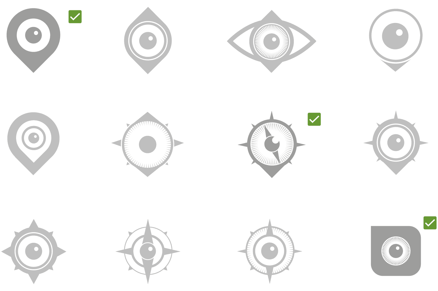
Here’s a small collection of the digital mockups
As you can see, at this point I chose three designs to conceptualize further.
Typography
Up to this point, I have simply focused on a graphical icon that will sit next to the words “Student Acuity.” So now it’s time to begin thinking about the most important element of the logo, which is typography.
The typography used in your logo will set the complete tone of your identity, not just within the logo itself but across all branded elements.
You don’t want to use more than one or two typographical styles in your logo. If you use more than that, it will likely clutter and defuse the tone of the message you’re trying to communicate to your target audience. And for obvious reasons, the typography has to be legible from a distance.
You can edit popular fonts to suit your logo’s requirements. For example, you have an array of different options available when adjusting the kerning and leading of a particular font.
Don’t underestimate the power of increasing or decreasing the leading of a typeface; it can be a powerful editing property when implemented effectively.
Also, there are an array of free font websites to help you find the best font suitable for the tone of your message.
Choosing the Best Design
Choosing the best design of the three logo concepts is almost always one of the most painful parts of the whole process.
To help with the decision, I of course talk with the startup founders. Subsequently, I ask for an array of opinions from the actual target audience who will most likely engage with the brand. Also, being a designer, I always ask fellow colleagues and friends to give me their critique. Based upon all of this feedback, I make a decision.
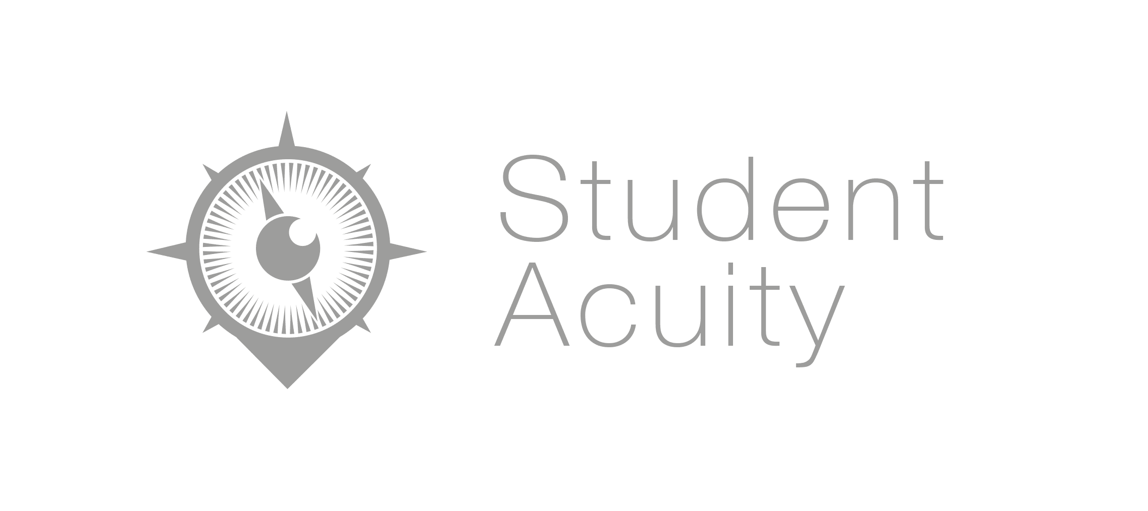
In this case, here was the logo that made the final cut:
Color
Once the logo itself is set, it’s time to think about an effective color scheme that will entice the target audience while also communicating the overall message of the company.
There is a hell of a lot of physiology in colors, so I advise you to check out this website before choosing a color combination for your startup. There are a complete array of subliminal messages that colors communicate to the human brain, so be sure to choose wisely!
I decided to pursue a green color palette for Startup Acuity. Green represents life, renewal, nature, and energy and is associated with growth, harmony, freshness, safety, fertility, and the environment. It was the perfect color to represent the mission and personality of this particular startup.
Finalized Logo
After defining the symbology, typography and color of the logo, I was able to put together the final result. I used a combination of the symbology from the word exercise to create a compelling, balanced and effective symbol that truly represented the core of Student Acuity’s mission.
Making Your Identity Consistent
Not only was I commissioned to design the logo of Startup Acuity but also the core product, which follows the same identity principles. I even went as far as designing their graphs, following a consistent style that is incorporated across the platform.
I can’t stress enough how important it is to incorporate your visual identity consistently across all aspects of your startup, whether that be marketing material, website banners, or something as small as email signatures.
The best brands always maintain a coherent style across their entire business. Visual identity, content style, photography, iconography, etc — every element of your identity needs to incorporate a sense of personality that is communicated to your target audience.
All images were provided by the author


