How do mobile app notifications function now and how will they change in the future? Here’s what startup founders and product managers need to know.
Most of us consume information on our smartphones in the same way: via apps.
We wake up in the morning, and open in quick succession our email app, the weather app, the news app, and of course, a whole suite of social media apps.
In fact, consumers spend 89% of their media time in mobile apps and only 11% on mobile sites.
But the way we’re getting information is changing. In the future, it’s possible that many of your app interactions will actually take place outside the app: in your notification layer.
Let’s examine how notifications function right now, what they’ll look like in the future, and how you can prepare your app for success.
Current State of Mobile App Notifications
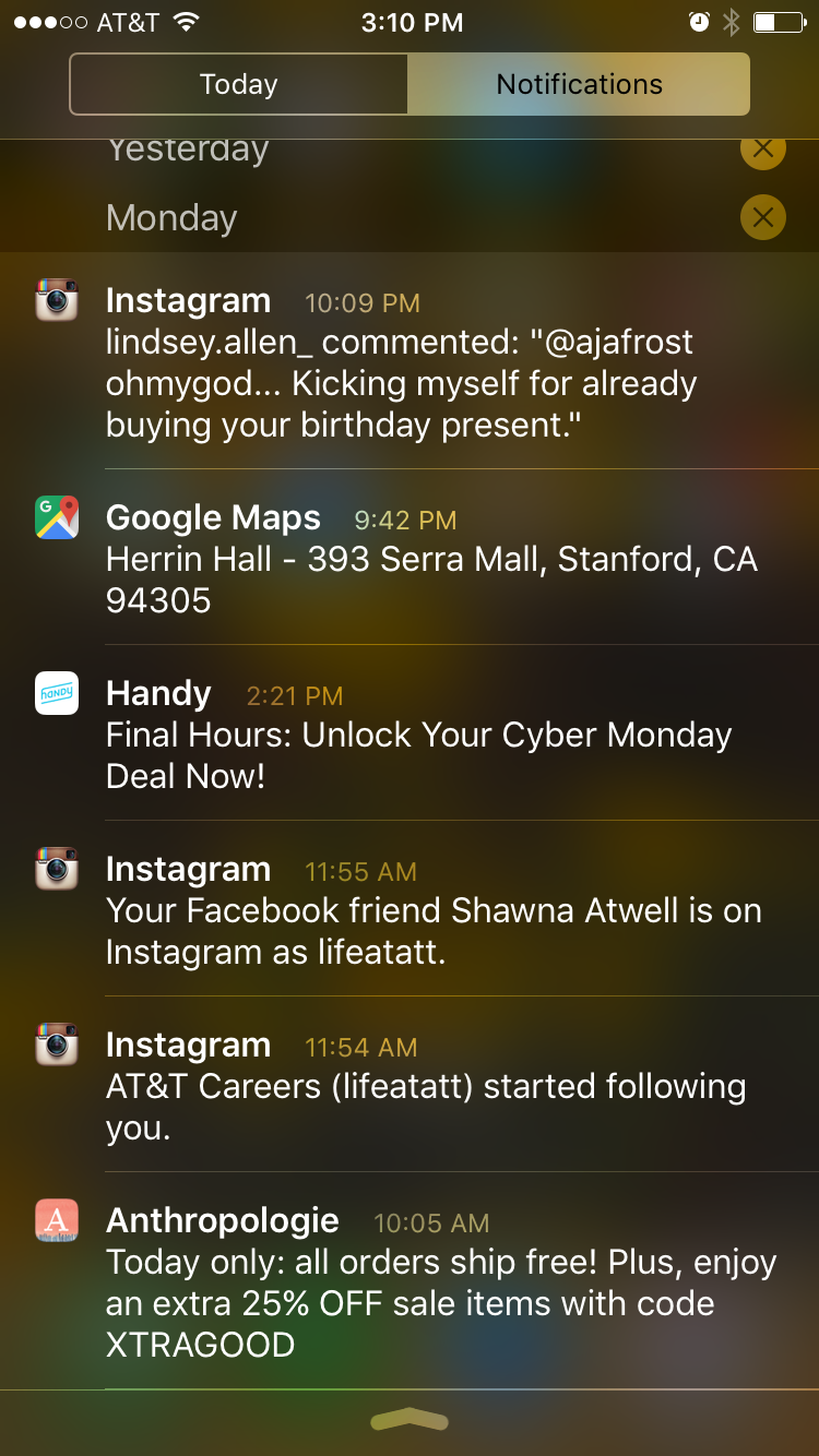
Currently, notifications are designed to tell users when apps that are inactive or running in the background have new information, including messages, upcoming events, or other relevant and timely data.
Notifications are displayed in three ways:
- Alerts or banners
- App badges
- Sounds or vibrations
However, it doesn’t matter whether users are presented with a message on their lock screen or see a banner pop up. In either case, they must interact with the notification in order to get more information.
For example, you might get a notification that you have a new email, but you won’t be able to read it without going into your email app.
In other words, the vast majority of notifications don’t exist in isolation — they function as shortcuts to your apps.
Opting In (or Out) of Mobile App Notifications
Notifications have a huge impact on app engagement. According to mobile strategy company Urban Airship, users are four times more engaged when they receive notifications.
One of the advantages of Android is that users must opt out of receiving notifications. With iOS, it’s the opposite: You must ask users for permission to send them notifications.
As a result, 59% of users enable push notifications on Android devices, while only 46% do so for Apple.
It also matters which category your product is in. Apps with time-sensitive features, like Uber, GrubHub, or Mint, fare far better than their less-timely peers.
While at the present it’s very important to get your individual opt-in rate as high as possible, it’s probably going to become even more critical in the future.
Interactive Notifications
The iOS 8 update enabling interactive notifications changed everything. Now app creators have the power to not only choose how a notification appears (banner, badge, sound), but also how users can respond.
Instead of serving as a portal to an app, notifications become activity hubs in and of themselves.
iOS 8 allows developers to include two to four response options (two for lock screen and banner notifications, four for popups.)
Let’s say the user has downloaded an airline app. The app could send a lock screen notification saying, “Your flight’s in 24 hours. Want to check in?” In response, the user could press “Sure” or “Later”— without ever moving away from the lock screen.
Or if the same alert appeared as a popup, the developer could also include the option to “Upgrade to first class” or “Enroll in TSA pre-check.” And again, the user wouldn’t have to switch apps to make any of these choices.
The value in this feature is clear. Instead of fighting for the user’s attention — since the user can only engage with one thing at a time — apps can “overlap” with one another, providing a smooth, convenient user experience.
As you can imagine, once this class of notifications becomes widely adopted, users will start to resist making any simple interactions within the app.
If they’re used to seamlessly checking in via a notification from their airline app, they’re going to be annoyed when, say, their personal finance app makes them go into the app to verify a deposit.
The Future of Mobile App Notifications
There are some apps that already use notifications as independent entities rather than gateways. Wut, a social messaging app that lets you send people “disappearing messages,” is one of the most popular examples.
When a user gets a Wut message, it shows up on his or her lock screen. Then, after a little bit, it vanishes.
Let’s project this idea forward. Paul Adams, VP of Product at Intercom, predicts:
“The idea of having a screen full of icons, representing independent apps, that need to be opened to experience them, is making less and less sense. The idea that these apps sit in the background, pushing content into a central experience, is making more and more sense. That central experience may be something that looks like a notification centre today, or something similar to Google Now, or something entirely new.”
Adams (and many other industry experts) believe that, in the future, apps will be designed in cards.
Think of the cards that make up your Facebook news feed and your Twitter stream. These cards look the same whether they’re appearing on your iPhone, tablet, or computer. In other words, they’re location ambivalent.
And that’s incredibly valuable for Facebook and Twitter, because if we were to move to a centralized app system — in which apps are notifications and vice versa — then having information that can move seamlessly across platforms will be a big competitive advantage.
That’s why startup founders and product managers might want to start thinking of their apps as a publishing system rather than a destination.
Advice for Startup Founders and Product Managers
So, what can startup founders and product managers do right now to prepare for the future? Treat notifications as a central part of your app strategy, rather than an afterthought.
Here are four key pieces of advice:
- Raise your notification receival rate as high as possible.
- Create engaging, relevant notifications.
- Optimize the interactive notifications feature.
- Start thinking about how your app’s content could internally migrate through devices.
Notification Receival Rate
As previously mentioned, users who download the Android version of your app will get your notifications by default. All you have to do is avoid annoying them so much that they’re motivated to turn your notifications off.
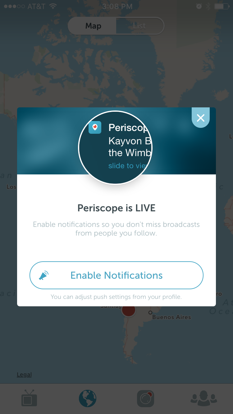
iOS users, on the other hand, must be convinced to opt in. To do so, be incredibly specific about how and why your notifications will add value.
Periscope does a great job of this. In just one sentence, the app tells you what type of notifications you’ll receive and why you’d want to get them.
Google Now’s “opt-in” ask is less effective. Although it gives the user a reason to opt in, that reason is far too vague to be useful.
And musical.ly’s request is the least persuasive of the three. The app uses the generic ask, completely missing the opportunity to give context.
Engaging, Relevant Notifications
While notifications are an exciting tool from a startup founder or product manager’s perspective, being bombarded with them or getting too many that are irrelevant will cause users to opt out.
Here are a few best practices:
Keep them short.
The most effective notifications are under two sentences.
Time them right.
You’re probably already using A/B testing and behavioral data to pick when to send your notifications. (And if you’re not, you should be!) However, make sure you’re also factoring in time zones.
Don’t send too many.
Once users opt out of notifications, it’s very unlikely they’ll opt back in. That means you want to play it safe when it comes to notification frequency.
Before you send a notification, ask yourself, “Would this motivate me to open the app?”
Make them relevant.
The most engaging notifications are timely, but you can be creative with this rule.
For example, if you have a recipe app and it’s National Doughnut Day, your notification could read: “Celebrate National Doughnut Day the old-fashioned way with our old-fashioned recipe!”
Tying notifications to your users’ locations and actions is also very important.
Optimize Interactive Notifications
You should prepare your app for what’s to come by building as much functionality and choice into interactive notifications as possible.
Start by plotting user flow for each of your client personas, taking note of every decision point. Each of these points could potentially become an interactive notification.
For example, let’s say that Cate, one of the user personas you’ve created for your dating app, typically logs in around 7 PM to reread all the messages she got that day and respond to a couple.
To give Cate (and her fellow users) a more frictionless experience, you could create an interactive notification that says: “Check out today’s messages!” with the options of “Yes,” “No,” and “In an hour.”
Do the same for every part of your users’ journey. Not only will your app engagement shoot up, but you’ll be better prepared for the next notification evolution.
Internal Migration
The last thing you should do to prepare is to begin reflecting on how the content that’s currently contained within your app could be unbundled.
While no one knows exactly what the future will look like, all trends point to the simplification and de-aggregation of apps.
So unpack your app. What features could potentially live outside of it? Probably the features you’re currently integrating into your notifications — the ones tied to small bites of information and quick choices.
However, the activities that require deep focus, high engagement, or extended interaction can and should stay within your app.
Which is why we don’t need to worry about “the end of apps.” Regardless of how notifications continue to transform, there will always be features that belong inside your application.
The app landscape is changing incredibly rapidly, which means startup founders and product managers have to move just as fast. By taking these steps, you’ll be ready for the notification revolution.


