Any product person knows how easy it is to get distracted by a new feature idea, new design idea, new app idea to launch into reality.
Shiny, new ideas are a dime a dozen. It can be tempting to start with an idea and run with it — to ship it, cross your fingers it finds a home, and validate its useful after shipping.
But more often than not, what happens in these scenarios is that you ship a great idea, but it doesn’t find an audience.
How do you rein in the ideas and build a product that will truly resonate with people in the wild?
The best products are designed with real people in mind — not just fellow product people. They come from fundamentally understanding people first, and designing real-world solutions that respond to their needs and motivations second. Not the other way around.
This is the difference between what I call designing people-first and product-first.
And while it’s easy to design product-first — just not very efficient or successful — it’s very hard to design a habit-forming product if you don’t fundamentally understand people.
A better option: Forget building for an idea. Build for a state of mind.
Here are four steps to understanding your users and designing people-first:
1. Identify the feeling
The first rule of thumb in getting to know your users and designing people-first is to identify the emotions you are designing for.
If you’re designing apps you need to know: How do people feel before they open your app? How do they feel after? If you haven’t launched your product yet, how do they feel when they open competitors’ apps?
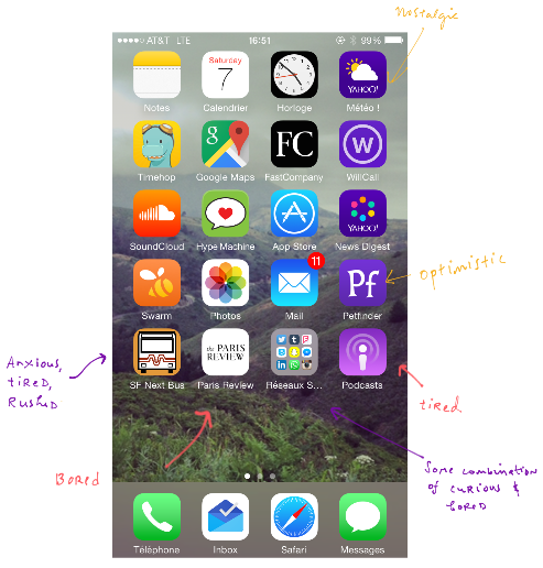
To get at this answer, try what I call the “Homescreen test” — a quick and dirty exercise to understanding your users.
It asks you (or your participants) to answer: What is my user’s state of mind when using my app? If you were to categorize the user’s app use by emotion, what would that look like?
Here’s what that looks like for me:
Homescreens are like diaries filled with your users’ daily activities, hopes, needs, and desires.
Ask yourself: What is my user’s state of mind when they open my app? If you can identify the feeling, you can identify the relief — and that’s where your product fits in.
2. Consider context
How people feel when they open your app is the baseline understanding you need to start designing something people will truly use. But where people are in place, in time, in history or routine — these are all going to impact the way people feel about your product, the way they use it, and how frequently they use it.
For instance, if your user’s context is urgency (say, rushing to work, in a medical emergency, or other urgencies) your design should respond to that: streamline it, reduce cognitive load, and save the bells and whistles for less pressing contexts (like pockets of leisure time and games).
When designing people-first, ask: What is my user’s current context? Always acknowledge and embrace what you know about user context in your design process.
3. Understand motivations
The third rule of thumb is to understand your user’s motivations and how they are prioritized.
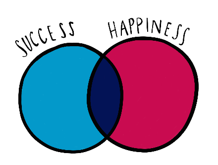
There are two things to keep in mind: You must understand the surface problem people are trying to solve (i.e. the task at hand), but also how hard they perceive that task to be. The value your product has to users depends on their success in achieving that task and in their happiness in getting there.
For instance, anyone who needs to travel from point A to point B on demand has a plethora of options in San Francisco: from Lyft, to Uber, Sidecar, and Flywheel, it’s a crowded and convenient marketplace for residents. But they don’t all necessarily make their users equally happy. That depends on what else they are motivated by, besides getting a ride.
In other words, the need for anyone opening those apps will be the same (travel to a destination), but the motivation for the type of travel is different depending on how introverted, how frugal, how stressed those users are — and that’s going to make an impact on product use and brand loyalty.
Always ask: Apart from the task, what is my user’s happiness dependent upon? If you can understand what your users’ happiness depends on, you can identify what opportunities there are to not only meet the bar, but to exceed it. That’s how you design a path to building loyalty.
4. Get to know your users’ values
The fourth step in getting to know your users is to get to know their values.
That means understanding who they are as people, and how their history, background, and life environment have informed them over time. Together these form a filter that helps determine how your users understand, relate to, and embrace your product.
To understand that, you might collect basic demographic information like age, gender, hometown, and education, but also specific details about the type of life experience that’s relevant to your app specifically. Maybe that’s political affiliation, taste in music, clothing size, or dietary restrictions — details that will help you find trends in the types of users your product resonates with.
Ask yourself: Where is my user coming from? What’s her filter on the world? How are her user interactions informed by who she is as a person in the world today?
There is an important caveat: It can be easy to lump your users into known groups (e.g. Millennials) during this step. But just because a group is easy to describe doesn’t mean that’s how your users should be grouped. Get specific!
Concluding thoughts
Do:
Layer your users’ backgrounds on last, and examine how that changes how they interact with your product and to what extent.
Don’t:
Lean too heavily on existing categories that may be less relevant to your product.
With these four steps to guide you, you’ll be on your way to understanding people and designing products they’ll want to return to again and again.
All illustrations featured in this article were created by Ximena Vengoechea.


