Whether they’re informative or simply click bait, you have to admit that there’s something about picture lists that’s hard to resist. It’s no wonder they go viral.
The thing about an image-heavy post (even if it’s “17 Grumpy Puppies“) is that our brains actually process images faster and more expansively than words. It makes sense seeing as 90% of the information our brains ingest is visual instead of written. And it turns out we process visual information 60,000 times faster than we process text.
After presenting these facts in a “Power of Images” webinar, Buzzsumo director and co-owner Steve Rayson laid out some cold, hard, data-driven facts on what’s working and what’s not when it comes to how we use images to get clicks and shares.
Let’s Talk Stats
Buzzsumo is a resource for finding total share numbers across different platforms for any search term. With some deep diving into posts that do well vs. posts that don’t, there are some clear findings in favor of making yours as visual as possible.

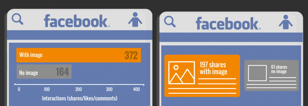
According to Buzzsumo’s research, sharing an article on Facebook with an image drastically outperforms sharing ones without: 197 shares vs. 61 shares.
But how do you make sure that when someone shares your post, it gets a large “OG” (Open Graph) image rather than a small thumbnail?
When someone shares your article to Facebook, the site will look for Open Graph tags in the code on your page (og: image) to pull the featured image. You can do it manually or using a number of plugins — Buffer suggests Yoast’s WordPress plugin. By tagging your images, you’re ensuring that Facebook is pulling the best of your article so you can get more shares.
On Twitter, pretty pictures with only a headline accompaniment won’t cut it. A large image with a summary far exceeds the shares you get with images or text alone.
You’ve probably seen the large summary + image card. It feels like a news clipping, which works well with Twitter being such an of-the-moment news destination. Twitter has a how-to to show you how to set up the card sharing with your own articles.
Looking at Buzzsumo’s findings, it’s obvious that it’s worth the time to go in and set this up on your blog or website. According to Buffer, tweets with images get 150% more retweets, 18% more clicks, and 89% more favorites.
The Perfect Post
But, just having images in your post won’t keep readers coming back, and it may not even get them to click. It’s the kind of images you use and the context of them as well.
To start, Buzzsumo found a text-to-image sweet spot: posts with the most shares have one image to every 75-100 words.
There are many ways to curate and structure a picture list post that you can use to suit your own brand story — but keep in mind through all of them that curation is important. The big perk of image posts is that we can scan them faster, but that makes it even more important that your reader can find value in every picture that they’re seeing. Make it worth their time, no matter how fleeting.
In Buzzsumo’s research, they uncovered five prominent types of picture list posts:
1. Explain a Concept
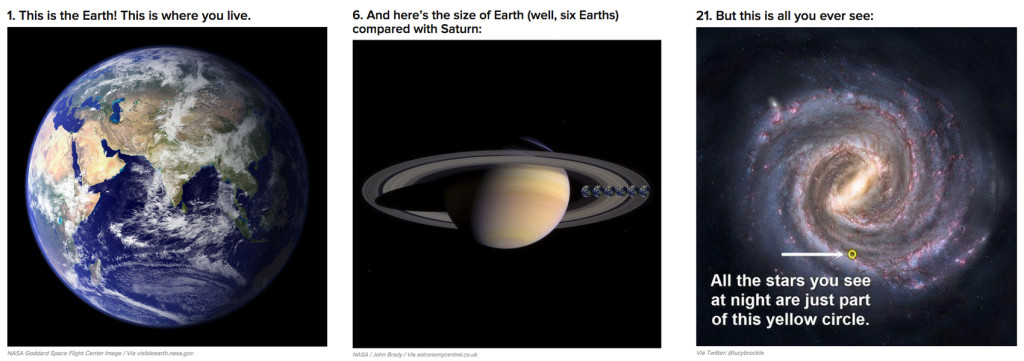
One of the most viral examples of this was a post made by none other than Buzzfeed: “26 Pictures Will Make You Re-Evaluate Your Entire Existence” (shown above).
They gave the viewer a real perspective of just how small we are on this planet and how small the planet is in the galaxy, continually zooming out until you realize that within the universe we are infinitesimal specks.
Other than the fact that this is something that everyone can relate to, the list was beneficial to the reader because it explained a very vast concept, step by step. If you’re trying to break down a concept in your industry that people would be interested in learning more about, pictures are one of the best ways to do it.
2. Show Comparisons
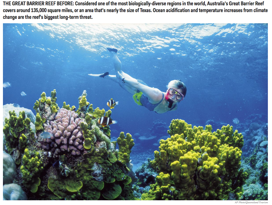
With global warming in full swing, there are no shortage of “then and now” environmental posts flooding the Internet (such as the one pictured above from Business Insider).
Whether your comparing major events, fashion fads, or environments across decades, comparison posts have a big appeal because there’s already a narrative and a conversation written into the photos. It’s easy for viewers to choose “this or that?” “Then or now?”
3. Tell a Story
After every major news event — good or bad — a series of pictures can serve as an expansive recap.
For example, to tell the story of the Oscars, Extra rounded up a picture recap and broke down the major plot points that went down so you could catch up in a matter of minutes even if you didn’t watch the awards show.
For more serious events like the riots in Ferguson, picture posts (like the one shown above from BBC News) showed the first-person story in an attempt to give outsiders a glance into the scene unfolding.
4. Curate an Original List
Buzzsumo says that curating nice images on a certain topic can act as a sort of “virtual brainstorming board” for a topic that’s particularly visual. For example, “The 14 Craziest Airbnb Accommodations From Around the World.”
These are especially beneficial on platforms like Pinterest (shown above) where people are already searching for visual inspiration.
5. How-To
Step-by-step how-tos are kind of like the original list post. Whether in cookbooks or DIY posts (like the hair styling guide above), seeing each step of a process in pictures gives more explanation than words alone can provide.
Take-Away Message
By now we all know that picture posts outperform text-only posts. But remember that giving your audience quality and insight with images takes things a step beyond those “39 Overly Adorable Kittens To Brighten Your Day” roundups that are adorable, but altogether not too innovative.
If you think about what your brand story can offer visually, you can begin to narrow in on options for picture posts that actually have something useful to offer your audience.


