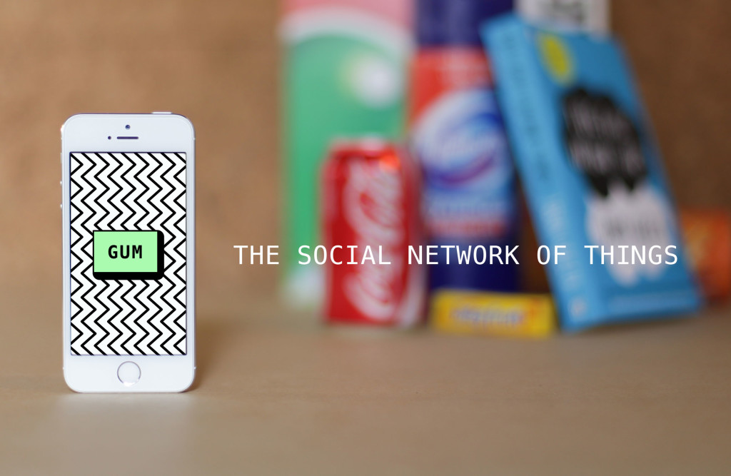
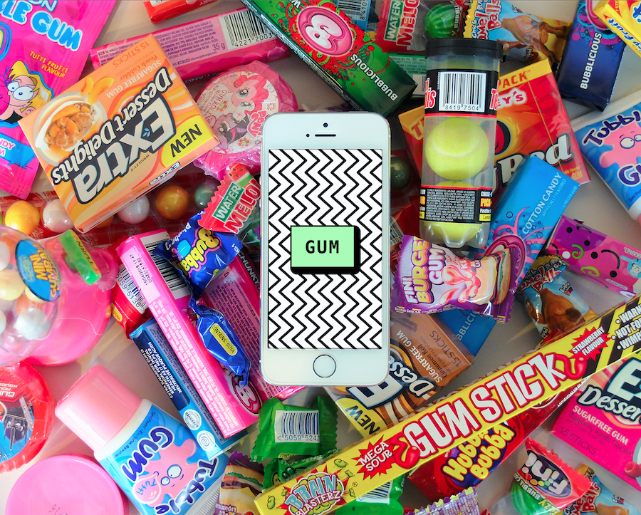
GUM is an app that lets you attach digital messages to real-world products, thereby turning physical things into social pinboards. But what exactly does that mean?
GUM cofounder David Rogerson told me that the mission of the app is to “open up the space around products.” This may sound a bit elusive, but it’s exactly the sort of lofty goal that attracted me to the app in the first place.
With the iPhone app, you simply snap a picture of a barcode on any item and then leave a note on that item or read other people’s notes. The app is playful, but grounded in a laundry list of potential use cases beyond the obvious.
It gives you the anonymity of correspondence with a pen pal, the convenience of online item reviews that we’re used to, and even some nostalgia for the days when we would only buy things from actual brick-and-mortar stores. Rogerson told me, “For a technology that is over 40 years old, it still captures people’s imagination.”
Part of that excitement stems from even the slightest chance that someone else across the world just might read your note in the app. As Rogerson put it, “[It’s] sort of like the builders of the pyramids who left their mark on the inside of the sealed structures.”
So, what kind of notes are people leaving? At the beginning mostly product reviews, product complaints and treasure hunts, but things have continued to get more innovative from there.
(Last week in Startup Stories, Beneath the Ink talked to use about disrupting the digital world of eReading. You can read it and many other startup adventures in our weekly series.)
The Idea
The concept for GUM came about at a studio in London called icoEx, specializing in interactive experiences. They thought up the idea after tracking the triumphant rise and fall of the QR code.
Rogerson said, “It became the technology equivalent of Comic Sans,” and they wanted to rescue it … or at least its functionality.
To take on their big idea, icoEx teamed up with Qi Interactive to divide and conquer: icoEx focused on project management, while Qi did the coding and backend infrastructure. Their early ideas were inspired by the Japanese handheld game console Barcode Battler.
Rogerson said that from this, they learned that “just the act of being able to express yourself about, against, or in relation to a product was quite powerful.” He added,
“There was something very public, yet secret about it at the same time. Sort of like graffiti … So this became the vision for the product — a really simple way to have an anonymous conversation contained in this very physical, yet ubiquitous thing.”
We’re definitely no strangers to leaving our two cents on a great or lousy product on Amazon or restaurant on Yelp, but Rogerson and his team noticed this interaction and community are missing when we’re in an actual store.
He explained, “It is a highly controlled space where products and brands broadcast at you.” With GUM, they want to bring conversations to that space before and after people connect with physical items.
From Features to Design
Once the team knew the mission of the product, they set out to come up with a vision of all of its features. Rogerson said that they came up with a list of all the things the app could do to impress people, and then they “ripped it to shreds.”
Under the guidance of Marcin Wiatr, GUM cofounder as well as Qi Director and technical lead on the project, they started taking out features one by one. Wiatr required a case for each feature, and Rogerson said the process could often feel uncomfortable because you were forced to really justify even those features that are usually a given. With a list of features finalized, the team moved on to design.
The Importance of Design
The look and feel of the app balances retro and modern aesthetics. Even the name GUM is inspired by the first barcode to go on a retail product which was — you guessed it — on a pack of Juicy Fruit gum circa 1974. As fun and cheeky as the design is, deciding on it was not only important for the branding, but also to ensure that users would be excited and inspired by this new kind of engagement.
Rogerson said that past experiences of both himself and Wiatr had led them to realize that, without the proper UX and design, their projects lacked that trust that they needed from their users. He explained,
“The big takeaway from this was design could go a long way to explain the promise of an idea and was a lot cheaper than developing code. For this reason, design became as much a priority as code.”
To meet their high expectations for design, Rogerson said that they thought beyond flat design vs. skeuomorphism. In fact, they worked with a designer who had less experience in digital design “in order to be surprised and challenged with alternative design solutions to common needs.”
Let Your Users Lead
What makes GUM so exciting, especially in this early stage, is that they’ve built this tool and they’ve asked users to do what they want with it, without too much suggestion or guidance. Much like last week’s Startup Story Beneath the Ink, GUM is learning new use cases straight from its users.
The app launched on iPhone in October 2014 at TechCrunch Disrupt in London, and since then they’ve received many new ideas and suggestions of how people and companies can use it. This feedback actually speaks immensely to their mission of examining what Rogerson calls “micro social networks.”
He said, “We’re really interested to see how giving people tools to create these nodes opens up new types of communication.”
Rogerson told me about a teacher who learned about GUM and has been encouraging students to gum comments to books in the library so that other students can get recommendations from their peers. The teacher said in his blog post about the app:
“This is an incredibly simple way to integrate technology into our library, but the social aspect makes it incredibly powerful. If every student turning a book into the library would leave a comment or recommendation, we would quickly have thoughts shared around every book. This would make this new augmented layer of social reading become even more powerful.”
Steve Lloyd, one of GUM’s own cofounders, created a flashy use for the app by using it as a pivotal part of his presentation at the Playful conference. He pulled out items from a grocery bag and scanned one, revealing a new presentation slide on the projector. Rogerson said, “The takeaway for the audience was a receipt listing all the products used, so they could go and put the presentation together themselves after a brief trip around the supermarket.”
Rogerson would like to see GUM partnerships with campaigns similar to those that companies have with Twitter and Facebook. He said, “Clearly, if someone has taken the time to scan your product’s barcode, you already have an engaged user, and it offers a perfect opportunity to reward them for that.” He even mentioned that it could be used in consumer advocacy to put pressure on brands that are harming the environment or are using child labor.
Embracing User Direction
Knowing that their users would help to define the growth of the product, they launched it while it was still in a malleable state. In fact, on their home page, they say:
“GUM is at an early stage. We don’t have accounts, we don’t have geolocation, we don’t have integrations with other social networks – and maybe we never will. We’re a small team trying to make something interesting and we’re as keen as mustard to hear what suggestions or feedback you may have.”
This disclaimer in itself sets up a level of dedication and initiative for the user to treat GUM as a tool to act on their own ideas. Rogerson said, “You don’t really know how people will use it and react to it … It makes sense to get something out there sooner and find out.”
Fitting In Just Enough to Stand Out
When it comes to finding product-market fit, Rogerson calls GUM a “social network of sorts,” with their competitors being a cross of the big social networks, shopping sites like Amazon and Red Laser, and also big hubs like Reddit.
He said, “I like the idea that GUM … is the go-to app for people when they are at that pause point before buying something. I want them to go there because it is honest, sometimes irreverent, and easy. Sort of like Reddit attached to the side of a physical object.”
He said that how we merge our physical and digital worlds through mobile devices will continue to determine not only how we shop, but also how we communicate and live. He added,
“The ‘internet of things‘ is a broad and often unhelpful catch-all for this shift, but I think we’ll see new players as well as the large incumbents fighting for this space.”
He predicts that it will be on us, the users, to determine who we will want mediating what we see in the physical world and what we decide to see.
What’s Next?
Moving forward, Rogerson said that they are going to try and tap into niche communities and create partnerships, but on the more technical end people are always asking for an Android version — I certainly did.
Android is definitely on their list, but since they’re self-funded, they’re focused on first perfecting their iOS app before moving forward on a new platform.
Features in the foreseeable future include notifications and the ability to follow certain gums. This could be especially useful if you’re considering making a big purchase and want to hear all angles before buying.
Rogerson said that judging by their own stats and testing, these features are predicted to significantly increase retention. He also hinted at going beyond barcodes and QR codes for new ways to interact with products, but we’ll just have to wait for more updates to see what that could entail.
You can download GUM on iOS for free.
Images were provided by GUM.


