Advice on how to create a clear, effective wireframe for your design team
Graphic designers working in app development are responsible for far more than creating pretty screens that are nice to look at. They’re the ones that bring your UI (user interface) and UX (user experience) to life. They take your ground-breaking idea and turn it into something that’s actually useful to the general public, which is no small task.
But as a startup, hiring a full-time in-house designer may be a little past your budget, so outsourcing the design of your app to a reputable designer or design firm may be the best way to go.
However, as with any time you hire external talent, great communication is essential. Without it, there are bound to be hang-ups, misunderstandings, and designs that weren’t exactly what you were looking for.
Fortunately, there’s a way around that mess. Creating a solid wireframe as the core document you give to your designer to work from is one of the best ways to move forward and turn your entrepreneurial idea into a money-making reality.
But making a great wireframe (especially one that speaks for itself) can be difficult for first-time entrepreneurs. So we’ve put together a list of our five best tips to help you create a wireframe that will make it easy to work with an external designer to produce an incredible app.
What Is a Wireframe?
Before we launch into our tips, let’s make sure we’re all clear on the basic concept of wireframes.
As we explained in a previous post, a wireframe is “a visual representation of the elements on a website or mobile application. Typically they are created in black and white and can be hand-drawn or created using an online tool.”
1. Treat It Like a Blueprint and Annotate Away
Pardon the obvious statement, but yes, the wireframe for your app is exactly like the blueprint for a new house.
Without a blueprint, builders don’t have any idea where to place electrical outlets, toilet and sink plumbing, or space in the wall supports for doorways. If all you do is give them a few snapshots of finished houses you like and the vague description of “I want a nice house,” there’s no telling what you’re going to get. Even the best builders in the world won’t be able to make exactly what you want from that kind of description — they need a specific plan from which to work.
It’s the same with app designers: without a detailed wireframe, your designers won’t know how to set up navigation menus, how to lay out their imagery in Photoshop, or the exact steps the user should go through.
The good thing is, getting started with a wireframe — even with no prior experience — is easy and free. A download of a software like JustInMind lets you get started by experimenting with creating rough screen designs with element placement and navigation. But JustInMind isn’t the only option, others include: Moqups, InVision, NinjaMock, and Basalmiq.
To help your designer, provide heavy (yet succinct) annotations on each of your wireframed screens and along the flow arrows in your wireframe map.
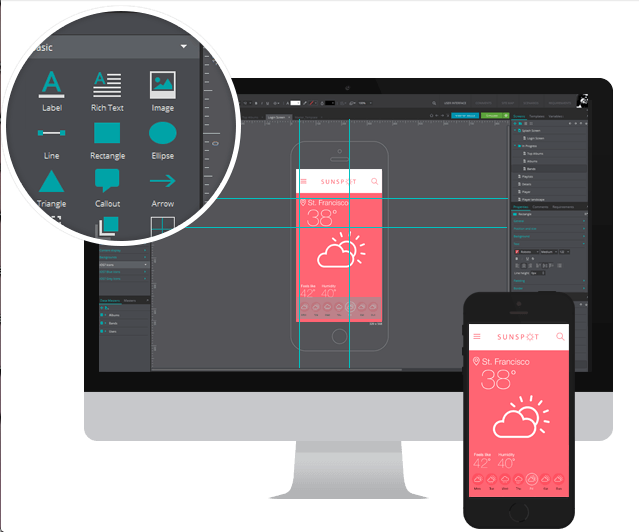
JustInMind’s screen wireframe management includes pointing arrows and callout bubbles to help you annotate your screens.
For example, it could really pay off to point out blocks of text or image content that may change frequently, so the surrounding design doesn’t depend too heavily on what’s currently there.
You’ll also want to let your designer know about monetization aspects and how they affect the flow of a section of the app. For example, if only paid subscribers have access to certain sections of your app, or if the acceptance or decline of an in-app-purchase affects the next screen the user is led to, your designer needs to know this. Drawing from his UX expertise, he may decide it’s best to present two different menus to subscribers and non-subscribers. He may even be able to use some of the tricks up his sleeve to visually motivate the in-app-purchase, thereby helping your app make more money.
2. Fill Dummy Boxes with Information
While your first round of wireframing will probably be quick and dirty in an attempt to get your ideas on paper, your first draft should not be what makes it past your internal review and out to your designer.
For example, in your very first draft, the actual written content won’t be your main concern. Tools like Dummy Lipsum can generate place-holder text for you while you make sure the basic look and feel are correct. But for subsequent versions, adding actual context and meaning to your screens will help the designer convey the true purpose of your app.

This is what it looks like when you use an automatic text populator like Dummy Lipsum: random words are selected for the menus, and Latin text (as you can see in the background) populates any text-based content space that’s more than a few words long. Changing the random words to actual menu choices and the background text to something that could actually end up in your final version will help ensure the design is more succinct.
Filling your screens in with actual information does two things for your designer:
It gives him a better idea of what the app is about and what its goals are.
This means his knowledge of the app goes beyond the brief app store description you provided when you were first discussing the details of the project. It also covers you in case you forget to mention any key details to him in your phone conversations.
It shows him where design improvements can be made.
You hire a designer to make things look good, yes. But a great designer is just as much about functionality as he is about art. When you hire a designer who knows a good deal about optimizing user experience and present him with actual UX information, he’ll be able to suggest optimizations for your app flow or screen layout that you wouldn’t have thought of before.
3. Share Past and Updated Versions
Give your designer the insight you had on your app from the very beginning. Send him the most current version of your app’s wireframe to work from: the more polished your ideas are, the better his output will be. But also send along the past versions (making sure to clearly label them as such), even from your very first basic sketches that were too ugly to show your own mother.
While he will work from the most recent version, seeing old ideas for screens, their annotations, and the notes on why some things were changed will help him create an app design that is more exact to your expectations. He’ll be able to see your thought process and know what ideas got rejected or changed and why. It ensures that he doesn’t repeat an idea you had but decided to ditch in favor of something else, saving time and energy on both ends (and likely saving you some money, to boot).
4. Do It in Hi-Fi
Hi-Fi (high fidelity) wireframes help convey the look, color and feel you want your app to have. They leave less to the imagination than hand-drawn sketches or simple diagrams made in PowerPoint or Paint programs.
(If you’d like to learn more about low vs. high fidelity, check out this previous post.)
They may end up costing a little bit of money, but software programs designed to help you develop hi-fi wireframes give you simple drag-and-drop elements so you can easily place text boxes, image holders, menu access, and buttons on a colorful mobile device screen. The good news is, once you get the hang of the program, you can blow through a number of screens in the same time it would take you to create one lo-fi screen.
Protoshare is a great tool that allows you to make both lo-fi and hi-fi app wireframes.
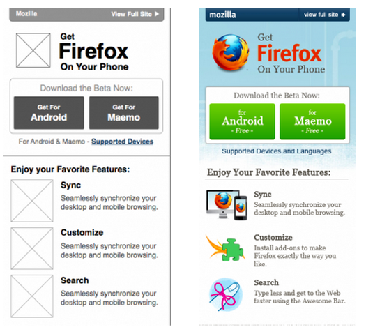
This side-by-side comparison shows you the difference between a lo-fi wireframe (left), from which you can start your basic coding, and a hi-fi wireframe (right), which you can use to create all the finishing touches.
Making your wireframes look closer to the live version of your app means your designer has to rely less on his imagination and can create an end product that’s incredibly polished and better matches your desires and UX needs.
5. Annotate Your Inspirations
Finally, coming from our own experience in working with teams of designers, we’d like to encourage you to add annotations about where your design and user flow inspirations came from.
Especially if you’re new to app development, chances are you took inspiration from a handful of your favorite apps for their design, user experience, and emotional feel as you use them, and you want to replicate parts of that within the context of your own app idea.
When you add an element to your wireframe that is particularly important to you, add an annotation along with it that states what app you got that inspiration from and why it’s so important to you. If your designer can use the app you’re referencing to understand what you like and get a feel for the same things you want your user to feel, you’ll be much happier with the end result.
Next Steps: Start Making an Effective Wireframe Today
Are you totally new to wireframing? Learn more about what it is and find some additional tools to get started.
Already have some wireframing experience and want a little more advanced advice on making a killer app? Check out this video we posted on designing Android apps for success.
Featured image from Balsamiq Mockups, a fantastic wireframing tool.
