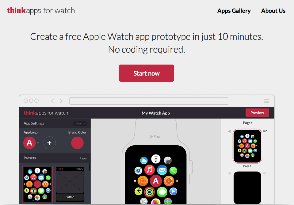
Today we’re launching ThinkApps for Watch, a new tool that lets you quickly and easily create an interactive prototype of an Apple Watch app. This case study will explain the process we followed to design and develop the tool from start to finish.
What Is ThinkApps for Watch?
As we explain in our launch announcement, ThinkApps for Watch is a free tool that will allow individuals and companies to make a design mockup of their Watch app in 10 minutes or less.
ThinkApps for Watch is specialized just for Apple Watch apps and is already programmed with all of the Watch guidelines and limitations in mind, so you don’t have to worry about knowing what’s allowed and what’s not.
In addition to quickly creating a free mockup of your app, you can easily get feedback or even conduct user research by sharing your design prototype via email or social media.
Becoming Our Own Client
ThinkApps is an on-demand service for designing and building stunning apps for web, mobile, and wearables, including Apple Watch. Based out of San Francisco, ThinkApps powers top Silicon Valley startups and innovative enterprise companies exploring the cutting edge.
At its core, we are a network of 1000+ top designers and technologists in more than 25 countries across North America, South America, Europe, and Asia. The network includes experts who are in the top 5% for any design, product, or technology sub-area.
To build ThinkApps for Watch, we tapped into the expertise of this network, including designers at PixelGrow and developers at DeSmart.
In creating this tool, we essentially became our own client. Thus, it was important to us to write this case study to explain the process we followed and shed some light on what’s involved in designing and developing a great software product.
Assembling the Team
We expect our clients to arrive with an idea. Ideally this idea will not just live inside the client’s head but will be spelled out in a one-page description of what they want to build, what their objectives are, and who they expect their audience to be.
Based on the particulars, including platform (e.g. web, Android, iOS), technology requirements (e.g. streaming video, high levels of data storage required), and timeline, ThinkApps will assess the skills and availability of the designers and developers in our network and assign the team that is best suited to the project.
ThinkApps essentially provides a one-stop shop where you can get all of the talent and expertise you need to build your product in a single place, including graphic, UX, and UI designers, plus front-end and back-end developers.
And once the team is assembled, they are essentially ready to start the next business day.
ThinkApps for Watch Team
In this case, ThinkApps itself was the client. We decided in March that we wanted to build a tool that would make it fast, fun, and easy to design your own Apple Watch app and wrote up a short description of the features we wanted to include.
We began reaching out to various designers and developers in our network to assess which teams had the Apple Watch expertise we needed. Once we knew which teams had the ability to help with the project, we inquired about their availability to determine who would actually be able to help us complete the project by our deadline.
In the end, the team involved three individuals from PixelGrow on the design side and four individuals from DeSmart on the development side. Filip Wasilewski joined the team in his usual role as ThinkApps project manager and Tarun Agarwal, ThinkApps co-founder, rounded things out as the client.
The client was located in San Francisco, with the design team in the Ukraine and the dev team in Poland. As Agarwal put it,
“People essentially came out of the ether and worked together from around the globe to launch a product from scratch in just eight weeks.”
Project Timeline
It took just eight weeks to complete the project from start to finish, including four weeks of design and four weeks of development (with some additional design questions and changes occurring during this later stage).
It’s important to note, however, that the time required of the client was only about three hours per week. So you can see how it would be possible for one client to have multiple products being built simultaneously, or, more likely, how a startup founder or tech product manager (PM) would be able to continue working on lots of other tasks while the product is being built.
If you contrast this with other options — such as learning to design and code yourself or recruiting five to eight employees to do the work in-house — it’s easy to see how much more efficient our process can be.
Design Phase
As mentioned above, the design phase took about four weeks.
During this phase, Agarwal (as the client) participated in one-hour video calls twice per week with the designers and project manager to discuss any questions and get regular updates. Over the course of the four weeks, there were eight calls total.
Design Team
The design team was from PixelGrow and included (from left to right):
- Oksana Sviridova — UI design
- Bogdan Sviridov — UI/UX design
- Nick Kurat — UX design (also co-founder of PixelGrow)
As Kurat put it, “PixelGrow is a digital design and development agency. We grow pixels into beautiful user experiences. Millions of users around the globe enjoy products we’ve created – from school kids to Pentagon officers.”
Design Kickoff
The first step after assembling the team was scheduling an introductory call with the designers, the project manager, and the client to explain the product vision and set clear expectations.
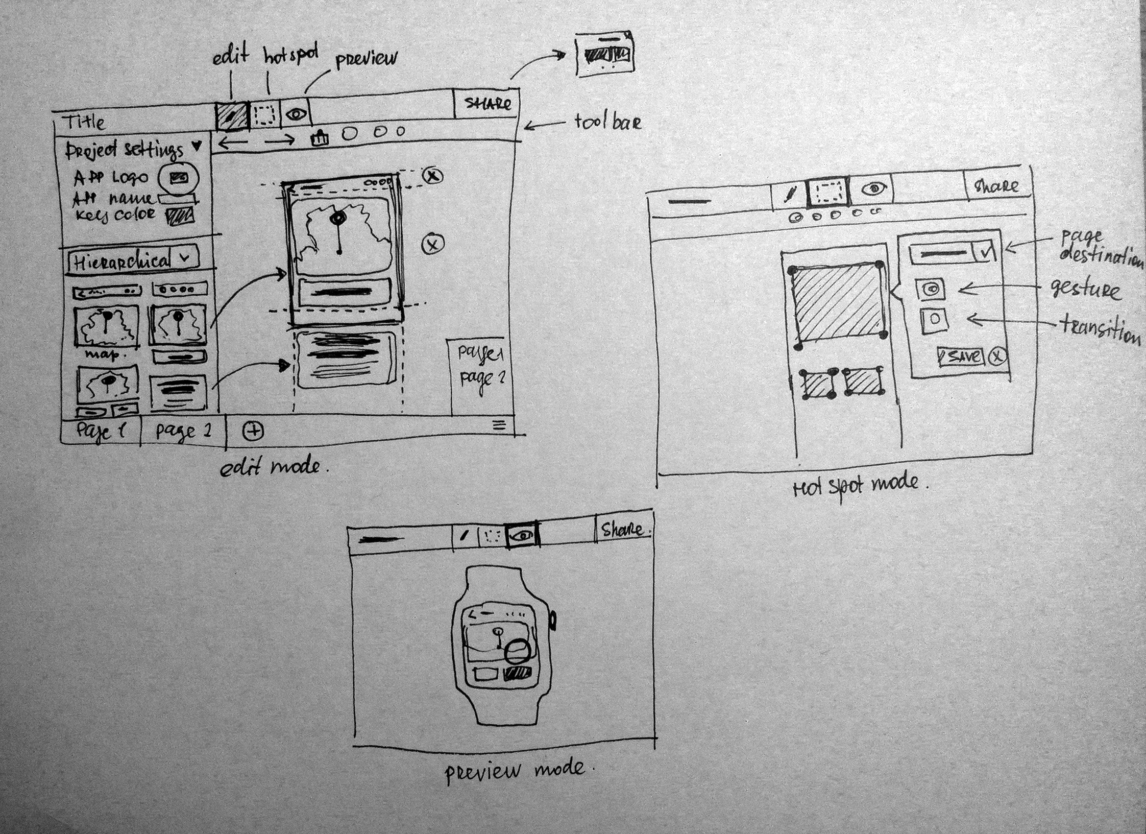
Hand-Drawn Sketches
After establishing the vision, the basic ideas were captured with hand-drawn sketches of the tool.
Wireframes
Once the basic idea was nailed down through hand-drawn sketches, the designers created wireframes. This was a collaborative process between the designers, project manager, and the client.
There were multiple iterations of these wireframes and conversations happened over twice-weekly calls, in addition to discussions via a dedicated online workspace in Basecamp (more on that below).
Full Design and Style Guide
The final step in the design process was to take the wireframes and create the fleshed out design.
The outcome of this phase is fully designed visual screens as well as a style guide that captures key decisions on fonts, typography, button styles, and other design elements.
Development Phase
The developers enter the picture once the design is complete.
For about 30-40% of ThinkApps projects, the designers and developers are part of the same team. But often, the best development expertise relevant for a particular app may be in a team different from the one that does the design. In this case, we might have utilized the same team for both components but there were scheduling conflicts.
(That’s just one of the benefits of the ThinkApps community – there are enough top-notch designers and developers in our network that you can always find the expertise you need right when you need it.)
For the development phase, clients are generally much less involved. They can participate as much as they wish, of course, but it is less necessary once the design phase is complete. The main involvement of the client is to review the live staged version of their app as it takes shape day over day, and to provide any feedback.
Development Team
The development team was from DeSmart and included (from left to right):
- Radosław Mejer – DeSmart CTO, PHP Developer
- Rafał Wyszomirski – Front-End Developer
- Robert Pajura – Quality Assurance Tester
- Piotr Duszyński – DeSmart CEO
As Damian Winkowski, who does business development for DeSmart, put it, “DeSmart is a team of highly experienced people. We prototype a lot, create web apps with PHP, and build mobile apps on Android/iOS.”
“We co-founded UXPin – a prototyping tool for UX Designers and Conventica – mobile app for event organisers, added Winkowski. “DeSmart is focused on business and tech side of the project. We work in Agile and believe in the lean approach to software development.”
Development Kickoff
The development kickoff occurs when the design portion of the project is complete, and it’s time to build.
In this case there was a team video conference to officially jump start development at the end of the fourth week. The ThinkApps project manager, Filip, helped to steer the transition from the designers to the developers, and the two teams talked directly to help answer any questions.
This approach helped to make the process as stress-free as possible by creating a seamless transition between the design and development phases.
Agile Sprints
The developers followed an agile approach to software development, dividing the work into two-week sprints. Within each sprint, they segmented the project into user stories and sub-stories.
The developers had “stand-up” meetings once a day amongst themselves and had one-hour video calls with the project manager and client once per week, with additional calls scheduled as necessary.
Over the course of the four-week development phase, there were approximately five team calls (not including the kickoff) and several side calls and conversation between the project manager and the developers.
Live Builds
In order to provide full transparency, our developers shared a live staging server with the project manager and client.
At the live staging server, you could see exactly what the developers see on a live basis as they build the app. And it happens automatically — as soon as the developer checked in or committed any code, the automated continuous integration system is triggered and you could see the latest version of the app through your browser instantly sitting in another city.
Also, since everyone has access to the source code repository, we also knew how many times and what code was committed throughout the day, which made it easy to review progress.
In addition to providing transparency, these live links to staging server also provided a lot of excitement, as it allowed us as the client to see the product literally coming to life.
Testing
As mentioned above, one member of the development team was a test engineer. This is significant because it allowed testing to occur throughout the development phase on an on-going basis, rather than just being tacked on at the end. Technically, a user story is considered completed once the test engineer verifies and ‘accepts’ it.
Analytics
In addition to tracking bugs, analytics are built in from the beginning to measure usage, user engagement, social sharing, and more.
These analytics not only help to measure and analyze various aspects of usage (such as which features are utilized the most and which should perhaps be discarded or improved) but can also help to actually increase engagement.
For example, by tracking the number of times a user views the mockup of an Apple Watch app they’ve created, we can create a system where an email engagement is triggered after the user returns a certain number of times.
Launch
The final step in the process is to launch the product and release it to the public.
For mobile apps, the process of launching involves making the app available for download in the appropriate app store. For web products, people often think of launch as the moment the website or web app goes live online.
Given the approach we follow with live staging, however, web products (such as the ThinkApps for Watch tool) are technically ready to go live, even during the development phase. But people who are not granted access to the product can’t access it.
In this case, launch involves moving the web product from the staging server (where it lives during development) to the actual production server. For this product, Davor Bagaric, who is another member of the ThinkApps network specializing in Amazon Web Services, helped set up the web product on AWS to ensure that it was scalable and fast.
And once the product has launched, the real fun begins. (That’s why we’re so excited to be launching the ThinkApps for Watch tool today!)
The client is able to collect feedback and see how users are actually using the product. In addition, our team remains available for 60 days post-launch to fix any bugs discovered once the product is out in the wild.
And of course, once you start collecting feedback, it’ll be time to start planning version 2.0, and the process starts all over again.
Tools
Given that we (the client, in this case) and the designers and developers were spread throughout the world, it was necessary to utilize a variety of tools to make communication and project management straight-forward and efficient.
The tools used in this particular project were similar to those generally used in client projects.
Communication Tools
We used Skype for all of the voice and/or video calls referenced above.
Even though the parties involved were located in different places, it was not difficult to schedule calls as the professionals in our network are used to working with people in different time zones.
We also used Basecamp for general communication about the project and basic file sharing. With Basecamp, discussions between team members and/or with us, the client, could happen anytime, and it was easy to assign to-dos to whomever needed to take action.
The best part? Everyone involved had access to everything, so there was as much transparency as possible.
Design Tools
The designers utilized Basecamp to share sketches, mockups, wireframes, etc. with the client and project manager, as well as the development team.
For wireframes, designers often use tools such as Balsamiq or InVision, and these design assets were generally sent as Adobe Photoshop or Adobe Fireworks files.
Development Tools
The developers used Pivotal Tracker to manage their agile sprints and create user stories. We also utilized BitBucket as a code repository and to share the code with everyone.
Try It Out for Yourself
Have a minute or two to spare? Go on and try out the ThinkApps for Watch tool to brainstorm and explore your app ideas.
Or, if you already have a specific app idea in mind and just need some help with development, reach out to our Apple Watch team. We can help you get started today.


