Since first announcing the Apple Watch last fall, Apple has been trying to prepare its developer community for the launch, providing early access to the WatchKit SDK in order to inspire well-thought-out apps for the wrist device.
Despite these efforts, it can be said that most of the third-party apps currently available have shown to be quite lackluster, slow, and cumbersome.
Some say this is because, in one of the most protracted releases in Apple’s history, developers lacked a real-life device on which to test, having to rely solely on a simulator to try out their app ideas.
Others attribute the lackluster third-party apps to the fact that this is a new platform and UX paradigm, and it will take some time for developers to start building best-practices knowledge.
Most likely, it is a combination of both.
In response, we present the 5 Apple Watch Design Patterns to Avoid in order to provide the best UX experience possible, at least with the current version of the Watch. (You can check out our Wish List for Apple Watch 2.0 here.)
Here are the top 5 things NOT to do when it comes to Apple Watch design …
1. Making Apple Watch Apps the Focus
Say what? Well, as crazy as this sounds, the best Apple Watch apps that we’ve seen aren’t ones that are the spotlight but instead act as a great wingman to your iOS app.
Badly-designed apps require a lot of reliance on the iPhone for dynamic data, a heavy dependency that slows down the experience. Take the Twitter app, for example. It takes some time to load up so you can browse your tweets, but the wait is far too long with a use case that isn’t that strong.
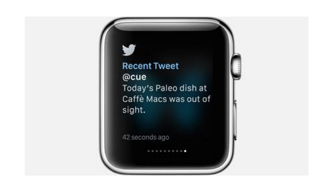
On the other hand, receiving tweet messages is passive rather than active, and, instead of you waiting for something to load up, it sends you a Glance notification and you can then peek at your wrist. There’s a fundamental UX difference here.
2. Dynamically-Generated Images
This is something Apple explicitly asks developers not to do and flows from the previous design pattern to avoid.
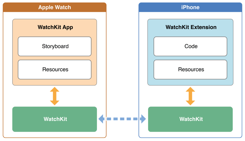
The choice of dynamic or static images alters the speed of the user experience significantly, due to the dependency Apple Watch has on the iPhone for passing dynamic content.
Static images are images that have been pre-loaded onto the Watch app at design-time and thus are accessible directly on the device, whereas dynamic images are accessed at run-time through the phone app.
If the app does require dynamic images, ensure the images are cached, using addCacheImage. This approach will speed up the app a little bit, especially if those images may persist for a while. Also, be sure to provide static images as placeholders while the dynamic images are loading.
(For more advice on incorporating images and animations without slowing down your Apple Watch app, check out our case study on Clover Clover.)
3. Assuming Users Know to Use Force Touch
Force Touch is almost certainly something that will become second-nature to Apple users over time, as we have seen the latest Macbook Air adopt it for their trackpads. Indications are good that the iPhone and iPad will get the feature, as well.
Force Touch distinguishes between a light tap and deep press and triggers a contextual menu of controls.
Unfortunately, there aren’t any visual queues that indicate to the user when Force Touch is an option. Users can easily recognize navigational hierarchies and buttons, but there are no visual indicators of contextual Force Touches at this time.
This can (and probably will) change in the future, as Apple provides some norm for indicating the availability of a contextual menu. But for now, the best thing that you as a developer or product manager can do is educate your users via the iPhone app.
Provide a walk-through of the Watch app and indicate the available features, including the different menu options and where users can expect to utilize a deep press to activate Force Touch.
4. Creating an Apple Watch App Just for the Heck of It
Not every iPhone app needs an Apple Watch app, as exciting as it is to market yourself as having a Watch version. For example, we won’t be holding our breath to seeing a Pages app for the wrist device, because there isn’t a real use case for it.
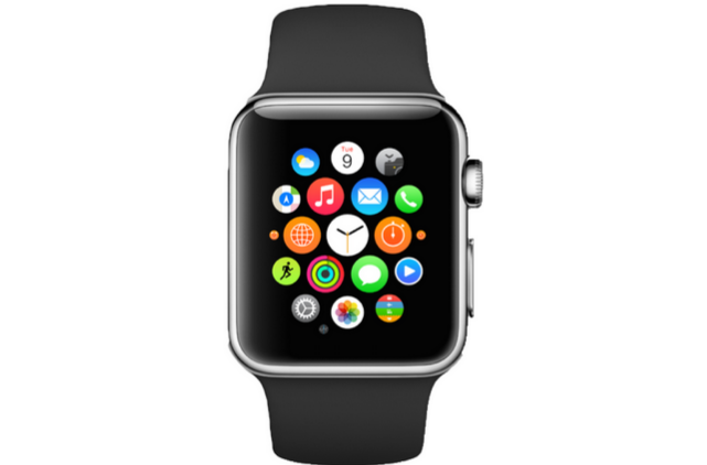
The number of icons on the Apple Watch springboard will also get crowded, and, without folder management on the Apple Watch, it’s not easy to navigate through a field of icons.
To be clear: we have seen great examples of supplement apps for the Watch, such as Mint (a budget app), with the Watch app showing a mere snapshot of your overall finances. The Remote App by Apple serves one purpose: to control the Apple TV, and the MLB At Bat app on Apple Watch can provide quick glances of your favorite team’s live scores.
The mindset should be that your iOS app is the core product offering, and the Apple Watch is a subset of that. Accordingly, it’s best to design your iOS app first and then, if you happen to find a good use case for extending it to the Apple Watch, that is your cue to move forward.
(For more insight into building for iPhone first vs. building simultaneously for the phone and Apple Watch, check out our case study of BUZL and CardioWorkoutTracker.)
5. Making Users Stare, When They Should Be Glancing
Less is more is certainly a narrative that applies to the Apple Watch.
Avoid packing your Glances with so much information that users would have to stare and read a paragraph. The purpose of Glances is to convey ideas with just a few words and images, providing information that is easy to read and literally glance-able.
Including more information than is necessary means the user will have to spend more time reading, while uncomfortably tilting his or her wrist to do so. This will also have an adverse effect on battery life.
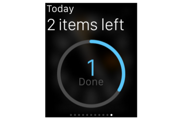
The illustration above from Apple shows how a Glance for a To-Do app simply states in large font how many tasks are remaining, as well as the number of tasks completed.
An orchestra or theater app might show the designated seat number, an airline app might show glance-able gate information, and a news app might show the latest headlines. Any additional information will be at the user’s initiation, and most likely should be handed-off to the iPhone.
Try to think of the Apple Watch like a more graphical pager (if you are old enough to know what that is): you get a quick notification and, if you need to take action on something, go find a phone (in this case your iPhone).
In Summary …
When the first iOS SDK came out in 2009, it took a couple of years for the best-practices in design to evolve, which undoubtedly correlated with hardware and SDK improvements. The same thing should be expected with Apple Watch app designs, which represent a design paradigm and mindset shift.
The lack of quality apps at launch can also be attributed to the Apple Watch not being in the hands of developers early on, forcing them to rely on a simulator instead (which is never a true substitute).
Either way, there are certain measures that can be implemented immediately and early best-practices that should be adhered to by developers and designers, in order to provide a user experience that isn’t frustrating.
If that isn’t achievable with the current tools and hardware at hand, it’s best to wait until they are available, rather than releasing a Watch app just for the sake of it.
Your app could be perfect for the Apple Watch and we’d love to help you build it. Try out the ThinkApps for Watch tool to brainstorm and explore your app ideas. Or, if you already have a specific idea in mind and just need some help with development, reach out to our Apple Watch team. We can help you get started today.


